11 Appendix
11.1 R and other free software
11.1.1 Learning R
There are a lot of blog, videos, tutorial and Q&A on stack for this. In addition to the resources in Chapter 2 - Getting Started, the list below is a personal selection that I found useful when learning R. Keep doing small exercises with made-up data to get used to the commands and functions. Also remember that once you make an RMarkdown file, it can be a ‘template’ for subsequent analyses of the same kind.
- YaRrr! The Pirate’s Guide to R
- R-bloggers posts and resources
- STDHA developed by Alboukadel Kassambara.
- QuickR website.
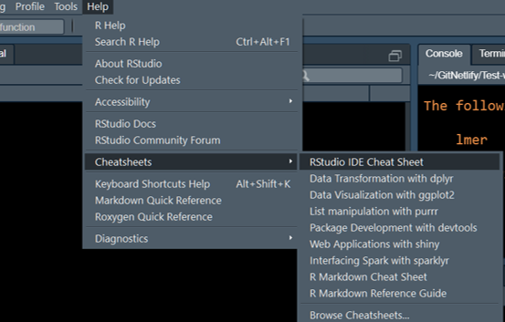
11.1.2 R Cheatsheets
A large collection of quick-reference cheatsheets are available for many packages online, or through the RStudio \(\rightarrow\) Help \(\rightarrow\) Cheatsheets link.
11.1.3 Other free software
Also take a look at these two free software.
- JAMOVI stats which is a user interface on top of R and also has modules for linear mixed effects analyses.
- JASP which also implements some simple Bayesian stats.
- Estimation statistics website for plotting distributions of differences.
- This paper on SuperPlots for showing all data points and hierarchical design.
- GPower for power analysis.
11.2 R Packages
11.2.1 Installing apps (packages)
Here is a quick summary of installing and loading packages.
The general command to do this is for packages on CRAN (the default for finding packages in R) is: install.packages("NAME OF PACKAGE"). Note that the name of the package should be in inverted commas.
To install multiple packages in one command, make a vector of their names: install.packages(c("PACKAGE1", "PACKAGE2", "PACKAGE3"))
More than 10,000 packages are available for free on CRAN, which is the default app store for R. Many packages are available on Github before they get on CRAN. All of the packages below are available on CRAN.
To install from sources other than CRAN, we first need to install the remotes package by typing install.packages("remotes"). (An alternative is the devtools package: install.packages("devtools")). You can then install from GitHub as follows: remotes::install_github("NAME OF PACKAGE").
Once a package is installed, you must start it by typing library(NAME OF PACKAGE) (Note: no inverted commas!) By default, installed packages are not loaded automatically, which reduces memory usage.
11.2.2 Apps for data handling
tidyversewhich is the most frequently used suite of apps on R. This includesdplyr,tidyrandggplot2which will be used often for data tables and drawing graphs. Thepurrandstringrpackages are also useful for data transformations and calculations. There is lots of online help on these apps, including RLadies Clean It Up. Here is blogpost on various functions such as filter, arrange, summarise etc., this one with an RNAseq example, and this from Data Carpentry.DTis a package for making dynamic tables when saving analysis. This only works with HTML outputs.
As is probably true in your own experience, a lot of time spent in quantitative data analysis is spent on data clean up before plotting graphs and doing the analysis ( e.g. removing unwanted variables, sorting, filtering) and transformations ( e.g. removing baseline, calculations of fold-changes, percentages etc.).
If you are doing this already in Excel or Prism, you can continue to that and import data tables into R in the correct format. Of course, purists will do all data handling in R using tidyverse apps and following Tidy data principles.
This can take some time to master in R (as is also true for Excel formulae or Prism which has 8 different table types) and can be a distraction when you want to focus on the statistical analysis.
When first starting out in R for statistics, use a small data set that you have previously analysed in Excel or Prism and can import into R in a format that is suitable for analysis directly ( i.e. without needing data wrangling in tidyverse).
11.2.3 Apps for data analysis
lme4andlmerTestwhich are used for linear mixed effects analysis of experiments with repeated-measures or random intercepts (and slopes) [1], [2].lmerTestadds tolme4and additionally gives more commonly necessarily details ( e.g. P values) in results of ANOVA. These are widely used and there are lots of Q&A on Stackoverflow. Here are one and two resources on mixed models.emmeansfor post-hoc tests after ANOVA. This is a simple and powerful package, with very good help pages, and an index page of all vignettes [3].ggResidpanelfor automatically plotting ANOVA diagnostics plots. Here’s the ggResidpanel documentation [4].bootfor logit transformation call, for example for transforming data between 0-1 when not normally distributed [5].pwrfor power analysis before planning experiments [6]. Here is the vignette for simple power analysis [6].
11.2.4 Apps for saving results
knitrandrmarkdownhelp you “knit” your analyses, including raw data, graphs, and the code/commands, as HTML files that you can share with others or use for record keeping. If you want to save them as Word or PDF formats (personally, I do not recommend them), you will also need to separately install TinyTex [7].
kableandkableExtrafor creating pretty tables. This is optional. Find out more here [R-kableExtra].cowplotis a package that has many features for making multi-panel graphs as I have used in this document [8].ggbeeswarmpackage is an add-on with more scatterplot options thangeom_jitteringgplot2[9].
RMarkdown is an easy to generate formatted HTML pages without having to learn HTML code. This book is written entirely in R Markdown using the bookdown package, so it isn’t too difficult [10].
Here is how to become a power user of RMarkdown. If you want to try something fancy, you could make tabbed sections sections in your output.
11.2.5 Packages needed for Chapters 3-7
These packages have to be loaded before attempting the analyses in this document. Depending on your installation, you may also need the hmisc and colorspace packages.
library(grafify, quietly = T)  #for colour schemes & theme
library(tidyr, quietly = T)  #table wrangling
library(dplyr, quietly = T)  #table wrangling
library(ggplot2, quietly = T)  #graphing results
library(lme4, quietly = T)  #linear mixed models (instead of anova)
library(lmerTest, quietly = T)  #for anova call for F & P values
library(emmeans, quietly = T)  #for posthoc comparisons
library(boot, quietly = T)  #for logit transformation call
library(ggResidpanel, quietly = T)  #for anova diagnostics plots
# for pretty tables
library(kableExtra, quietly = T)  #for pretty tables
library(DT, quietly = T)  #for dynamic table in html file
R/RStudio help you run many packages, which can be thought of as apps for specific purposes. Just like with a new PC or phone, we will first need to install a number of apps (packages) for our needs. These are listed below. Every package also has its own documentation page with vignettes/examples.
11.2.6 kable & kableExtra
These two help with generating pretty tables. knitr::kable is a built in command in RMarkdown. kableExtra package gives it additional options. Find out more here.
Note that pretty tables from kable will remove all other text from outputs and not advised unless you’re making a pretty report.
11.2.7 RStudio Code Snippets
In Rstudio go to Tools > Global Options > Code > Edit Snippets to save many lines of code that you might use repeatedly. These are called snippets. Find out more here.
The following examples show options for kable & ggplot can be saved as snippets. Rstudio will prompt you to finish the snippet and you won’t have to type long lines of same code repeatedly.
In above code, ${1:title} will let you change that part i.e. give different tables different captions.
snippet cowplot_addon
theme_cowplot(20)+
  labs(title = "{1:title}",
       x = "{1:title}", y = "{1:title}")+
  colorblindr::scale_colour_OkabeIto()
This can be added at the end of ggplot code to assign cowplot theme and colourblind compatible colours, titles etc.
11.2.8 knitr and RMarkdown
knitr is a package that converts RMarkdown files into formatted HTML (PDF or Word) files. The advantage of RMarkdown is that we can easily use formatting e.g. bold, italic, formulae, bullet lists, numbered lists etc. without learning HTML code. For example, words surrounded by * or underscore _ are rendered in italics, and words surrounded by ** or double underscore __ are rendered bold. A line starting with a - or . automatically becomes a bullet list, and lines starting with a number becomes a numbered list. R code chunks are outlined within three backticks ``` {r} ```. See this tutorial for more resources here.
Actually, this is done by Markdown, and RMarkdown builds on this by allowing R code within Markdown files. So we have the benefit of formatting plus code and results.
See this page for how to write formatted text in RMarkdown. This document was created using the bookdown [10], R Markdown and knitr [7], in RStudio.
11.3 Importing data into RStudio
As is usual in R, there are multiple ways of doing one thing in R. Data can be imported in many ways, and what is important is the format of the data table.
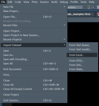
The easy way for most is to use the RStudio option.
Name the imported table and check the file by using by typing View("name_of_your_file) command.
I often use read.csv to load data tables that are in the comma separated values format. If you did preliminary analyses in Excel or Prism, ensure you export the table in basic .csv format (rather than alternatives like UTF-8, Macintosh, MS-DOS etc. or try the one that works for your setup).
The command is simple, especially if the file is in the working directory, otherwise just give the path to file within quotes "path/to/file. In Windows, you’ll need to use forward slash and not the default back slash.
For all data used for ANOVAs, ensure that categorical variables i.e. all fixed and random factors, are entered as alphanumeric characters. If these are numbers, R will think of them as quantitative variables! It is best to explicitly convert categorical variables into factors using the as.factor() function. In general, it is best to do the following: Table$column_name <- as.factor(Table$column_name) for all categorical variables even if entered as numbers (e.g. Time, Subject IDs etc.). Failing to do this will result in erroneous ANOVA output.
Before fitting models, check your table with str(Table_name) to see whether categorical and numerical variables are correctly encoded after importing tables into R.
11.4 Long and wide data tables
You MUST pay attention to the way your data table is. In R, each variable should uniquely be in one column. At first this seems like a complicated R requirement, but it isn’t. For instance, the correct type of table for data entry is also essential in Prism - you will get the wrong results if you use Column vs Group data tables in Prism.
Similarly in R, the quantitative variable should be in ONE column. This is called the long table format; the opposite is the wide format.
Here is an example of a long data format - the quantiative measurement of IL6 is one column, and other independent variables (factors), such as genotype and experiment, are in a column each. Each row is unique and defines each measurement.
| Genotype | Exp | IL6 |
|---|---|---|
| WT | Exp_1 | 1.312 |
| KO | Exp_1 | 1.953 |
| WT | Exp_2 | 2.171 |
| KO | Exp_2 | 4.106 |
| WT | Exp_3 | 1.498 |
Here is the same table in wide format.
| Exp | WT | KO |
|---|---|---|
| Exp_1 | 1.312 | 1.953 |
| Exp_2 | 2.171 | 4.106 |
| Exp_3 | 1.498 | 1.525 |
| Exp_4 | 1.089 | 0.948 |
| Exp_5 | 1.271 | 1.752 |
11.4.1 Inter-converting table formats
The tidyr package [11] is used to convert data table formats using the pivot_longer and pivot_wider commands. An example below and more here.
Starting with the long format Table 11.2, use pivot_wider to select the column that should contains the names of new columns (in our case it will be the two genotypes) and the column that contains the dependent variable (IL6 in our case)
library(tidyr) #invoke the package
Cytokine %>%  #select the data table
  pivot_wider(id_cols = "Exp", #select the column(s) that remain
              names_from = "Genotype", #choose new column names from here
              values_from = "IL6") #choose values in columns from here
# A tibble: 33 × 3
Exp WT KO
<chr> <dbl> <dbl>
1 Exp_1 1.31 1.95
2 Exp_2 2.17 4.11
3 Exp_3 1.50 1.52
4 Exp_4 1.09 0.948
5 Exp_5 1.27 1.75
6 Exp_6 3.01 4.92
7 Exp_7 9.69 13.9
8 Exp_8 2.77 3.72
9 Exp_9 6.77 8.14
10 Exp_10 0.492 2.42
# ℹ 23 more rowsThe reverse is simple, too. Here we start with the wide table in Table Table 11.3 above.
Cytowide %>% #select the data table
  pivot_longer(cols = c("WT", "KO"), #columns to be combined
               names_to = "Genotype", #put column names in this new column
               values_to = "IL6") #put values in this new column
# A tibble: 66 × 3
Exp Genotype IL6
<chr> <chr> <dbl>
1 Exp_1 WT 1.31
2 Exp_1 KO 1.95
3 Exp_2 WT 2.17
4 Exp_2 KO 4.11
5 Exp_3 WT 1.50
6 Exp_3 KO 1.52
7 Exp_4 WT 1.09
8 Exp_4 KO 0.948
9 Exp_5 WT 1.27
10 Exp_5 KO 1.75
# ℹ 56 more rows11.4.2 Excel alternative
Power Query option in Excel can be used to make long tables which can be imported into R. See this video on shaping and pivoting/unpivoting data in Excel.
11.5 Calculating Mean, SD, SEM & \(CI\) in long format
This qualifies as one of the things that should be simple enough but needs several lines of code. But the power of R is such that I have managed to get the mean and SD of a table with 1.4M rows of values (from microscopy) - a table that Prism or Excel couldn’t even open.
11.5.1 Using aggregate
Base R has a pretty powerful aggregate function that is fast and flexible. But the dplyr way is more friendly for new users.
aggregate is very flexible, as it can group by variables and perform calculations such as mean, SD, SEM etc. FUN argument can take base functions or user-defined ones.
aggregate(x = Cytokine$IL6,
          by = list(Cytokine$Genotype),
          FUN = "mean")
Group.1 x
1 KO 5.913191
2 WT 2.98502811.5.2 Using grafify
grafify has a function called table_summary that uses aggregate to give you mean, median, SD and Count.
table_summary(data = Cytokine,
              Ycol = "IL6",
              ByGroup = "Genotype")
Genotype IL6.Mean IL6.Median IL6.SD IL6.Count
1 KO 5.913191 4.513057 6.325244 33
2 WT 2.985028 2.130989 2.690373 3311.5.3 Using dplyr
Here’s how to do it using dplyr. The group_by() and summarise() are used to get summaries of the continuous variable grouped by dependent variables. This chapter in Stat 545 is a very good.
The pipe %>% operator (Ctrl+Shift+M is the short-cut for the pipe in Windows) that passes results from one function to the next, which can be on a different line. This makes code easier to read.
Cytokine %>%  #select the table
  group_by(Genotype) %>%  #group by variables, could be more than one
  summarise(              #summarise allows many new columns
    Mean_IL6 = mean(IL6), #new column Mean_IL6 calculated as mean() of IL6
    SD_IL6 = sd(IL6), #built-in sd() formula
    SEM_IL6 = sd(IL6)/sqrt(length(IL6)), #sem calculation
    CI95_t = abs(qt(0.025, 32))*sd(IL6)/sqrt(length(IL6)), #CI95 with t-critical for df 33
    CI95_z = abs(qnorm(0.025))*sd(IL6)/sqrt(length(IL6))) #CI95 assuming normal distribution
# A tibble: 2 × 6
Genotype Mean_IL6 SD_IL6 SEM_IL6 CI95_t CI95_z
<fct> <dbl> <dbl> <dbl> <dbl> <dbl>
1 KO 5.91 6.33 1.10 2.24 2.16
2 WT 2.99 2.69 0.468 0.954 0.91811.6 Plotting graphs
This document is not designed to cover the phenomenally wide range of great-looking graphs that can be plotted in R using ggplot2. Description on all commands in ggplot2 is beyond the scope of this Workshop.
The grammar of graphics idea is to map various plotting geometries (e.g. scatter plots, boxplots, violin plots etc.) on aesthetics defined by the (data) variables in your data table. Data are mapped to X or Y using aes() argument and multiple geometries can be added using geom_point(), geom_boxplot(), layers as needed. Shape, colour, size etc. for every geometry can be independently controlled and mapped to the data to create rich multidimensional plots.
For more details refer to the book on Elegant Graphics for Data Analysis and get the idea of the basic philosophy.
When in a hurry, this R Graph Gallery or Top 50 graphs can get you the code directly.
For this document, I have used grafify defaults with colourblind-compatible Okabe-Ito default scheme in scale_fill_grafify and scale_colour_grafify.
11.6.1 Examples of graphs
The stat_summary option is less used and even I was not too familiar with it when I started. Here’s a great resource for plotting graphs with error bars without having to manually calculate ranges for ymin and ymax arguments in geom_errorbar and others.
The code below shows graphs using the stat_summary layer that calculates a “summary” from data (e.g. mean, SD, CI etc.) using functions from the hmisc package. (You can also define you own functions.) Below I use fun.data = mean_sdl to calculate SD; the default for mean_sdl is to calculate mean \(\pm\) 2SD. We can change this using by setting the mult argument as follows: fun.args = list(mult = 1) to calculate mean \(\pm\) 1SD.
Another options is mean_cl_normal which will plot \(CI_{95}\) based on critical values from the t distribution. The mean_se option calculates the SEM and can be used to plot \(CI_{95}\) using multiples from t or \(z\) distributions.
Wherever possible, show all data points and scatter, and describe what error bars represent.
11.6.2 Scatterplot/bar graphs \(\pm\) SD.
ggplot(Micebw,
       aes(Diet, Bodyweight))+
  stat_summary(aes(fill = Diet), #fill colour
               fun = "mean", #calculate mean to plot
               geom = "bar", #geometry to plot
               linewidth = 0.8,   #bar border
               colour = "black", #border colour
               width = 0.4)+ #width of the geometry
  geom_point(size = 3,
             stroke = 0.8,
             shape = 21,
             position = position_jitter(width = 0.05),
             aes(fill = Diet))+
  stat_summary(fun.data = "mean_sdl", #calculate SD of data
               fun.args = list(mult = 1), #multiple of SD to plot (default = 2)
               width = 0.1, #width of the geometry
               linewidth = 0.8,  #thickness of errorbar
               geom = "errorbar")+ #geometry to plot
  theme_grafify()+ #theme
  scale_fill_grafify()+
  labs(title = "Bodyweight graph",
       x = "Diet", y = "Bodyweight (g)")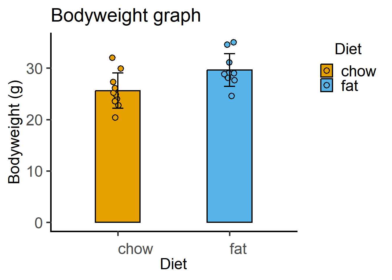
11.6.3 With grafify
A scatter-bar plot is very easy with grafify.
plot_scatterbar_sd(Micebw,
                   Diet,
                   Bodyweight)+
  labs(title = "Bar & SD plot with grafify")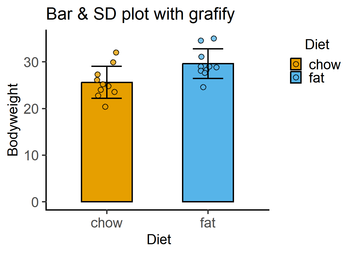
11.6.4 Scatterplot/bar graphs \(\pm\) \(CI_{95}\)
First with the critical values from the t distribution using the mean_cl_normal option.
ggplot(Micebw,
       aes(Diet, Bodyweight))+
  stat_summary(fun = "mean",
               aes(fill = Diet),
               geom = "bar", #stat & geometry
               colour = "black",
               linewidth = 0.8,
               width = 0.4)+
  geom_point(shape = 21,
             stroke = 0.8,
             position = position_jitter(width = 0.05),
             size = 3,
             aes(fill = Diet))+
  stat_summary(fun.data = "mean_cl_normal", #CI95 based on z distribution
               width = 0.1,
               linewidth = 0.8,
               geom = "errorbar")+ #geometry
  theme_grafify()+
  scale_fill_grafify()+
  labs(title = "Body weight graph",
       subtitle = "Mean & CI95 from t distribution",
       x = "Diet", y = "Bodyweight (g)")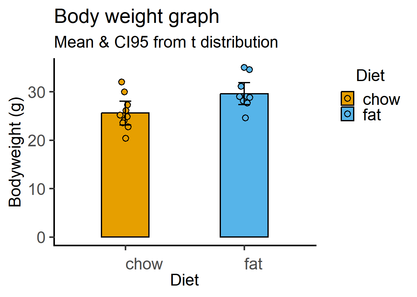
This time with the \(z\) distribution critical values for Df = 9 (10 values per group). Recall that \(CI_{95}\) is calculated as a multiple of the SEM based on the critical value of the t distribution. We calculate SEM using the mean_se function and multiple it with the critical value (quantile) obtained using the qnorm function in base R (read about it using ?qnorm().
ggplot(Micebw, aes(Diet, Bodyweight))+
  stat_summary(fun = "mean",
               aes(fill = Diet),
               geom = "bar", #stat & geometry
               colour = "black",
               linewidth = 0.8,
               width = 0.4)+
  geom_point(size = 3,
             shape = 21,
             stroke = 0.8,
             aes(fill = Diet),
             position = position_jitter(width = 0.05))+
  stat_summary(fun.data = "mean_se", #calculate SEM
               fun.args = list(mult = #qnorm() for multiple from normal distribution
                                 qnorm(0.025,   #lower tail p value 0.025
                                       lower.tail = F)), #to get positive value
               width = 0.1,
               linewidth = 0.8,
               geom = "errorbar")+
  theme_grafify()+
  scale_fill_grafify()+
  labs(title = "Body weight graph",
       subtitle = "Mean & CI95 from z distribution",
       x = "Diet", y = "Bodyweight (g)")
11.7 Data visualisation
We discuss data presentation in detail in the Writing Workshop. Here are a couple of great resources on how to make use of R/RStudio & ggplot2 for making graphs that easily convey your findings and the main take-home message.
- Look up the section on Data Visualization in ModernDrive
- Great tips here in this series by Andrew Heiss.