| Diet | Bodyweight |
|---|---|
| chow | 29.928 |
| chow | 27.315 |
| chow | 24.029 |
| chow | 24.834 |
| chow | 25.177 |
| chow | 20.364 |
| chow | 22.743 |
| chow | 23.534 |
| chow | 26.101 |
| chow | 32.021 |
| fat | 28.259 |
| fat | 28.987 |
| fat | 29.010 |
| fat | 24.562 |
| fat | 34.561 |
| fat | 28.076 |
| fat | 28.837 |
| fat | 31.094 |
| fat | 27.657 |
| fat | 35.044 |
4 Student’s t test
In this chapter we use example data from two groups that contain observations that are (i) independent or (ii) paired/matched. We use the t.test function in base R for unpaired and paired data, one-sample t test and linear model analysis.
Before proceeding, ensure that your data table is in the long format and categorical variables are encoded as factors. Here are the packages needed for these analyses.
4.1 Unpaired t test - mouse bodyweights
This is also called independent samples t test. The data we will analyse in Table 4.1 are bodyweights (in gram) of mice fed regular or high-fat chow. We want to find out whether the bodyweights of the groups are different. As always, the null hypothesis is that there is no difference between the two groups. There are a total of 10 mice per group (so the total degrees of freedom = 20 – 2 = 18). This means we will be looking up a t distribution with Df = 18 to get the P value.
4.1.1 Exploratory plot
Here is a box and whisker plot with all data plotted. In the Appendix, these same data are plotted as mean \(\pm\) SD.
ggplot(Micebw,
       aes(x = Diet,
           y = Bodyweight))+ #data & X, Y aesthetics
  geom_boxplot(aes(fill = Diet), #boxplot geometry & fill aesthetic
               outlier.alpha = 0, #don't show outliers (0 opacity)
               alpha = 0.2,  #transparency of fill colour
               width = 0.4)+ #box width
  geom_point(aes(fill = Diet), #scatter plot geometry
             size = 3,   #symbol size
             shape = 21, #symbol type
             position = position_jitter(width = 0.05), #reduce overlap
             alpha = 0.9)+ #transparency of symbols
  labs(title = "Mouse bodyweights", #plot title
       x = "Diet", y = "Weight (g)")+ #X & Y axis labels
  scale_fill_grafify()+   #fill palette
  theme_grafify()         #grafify theme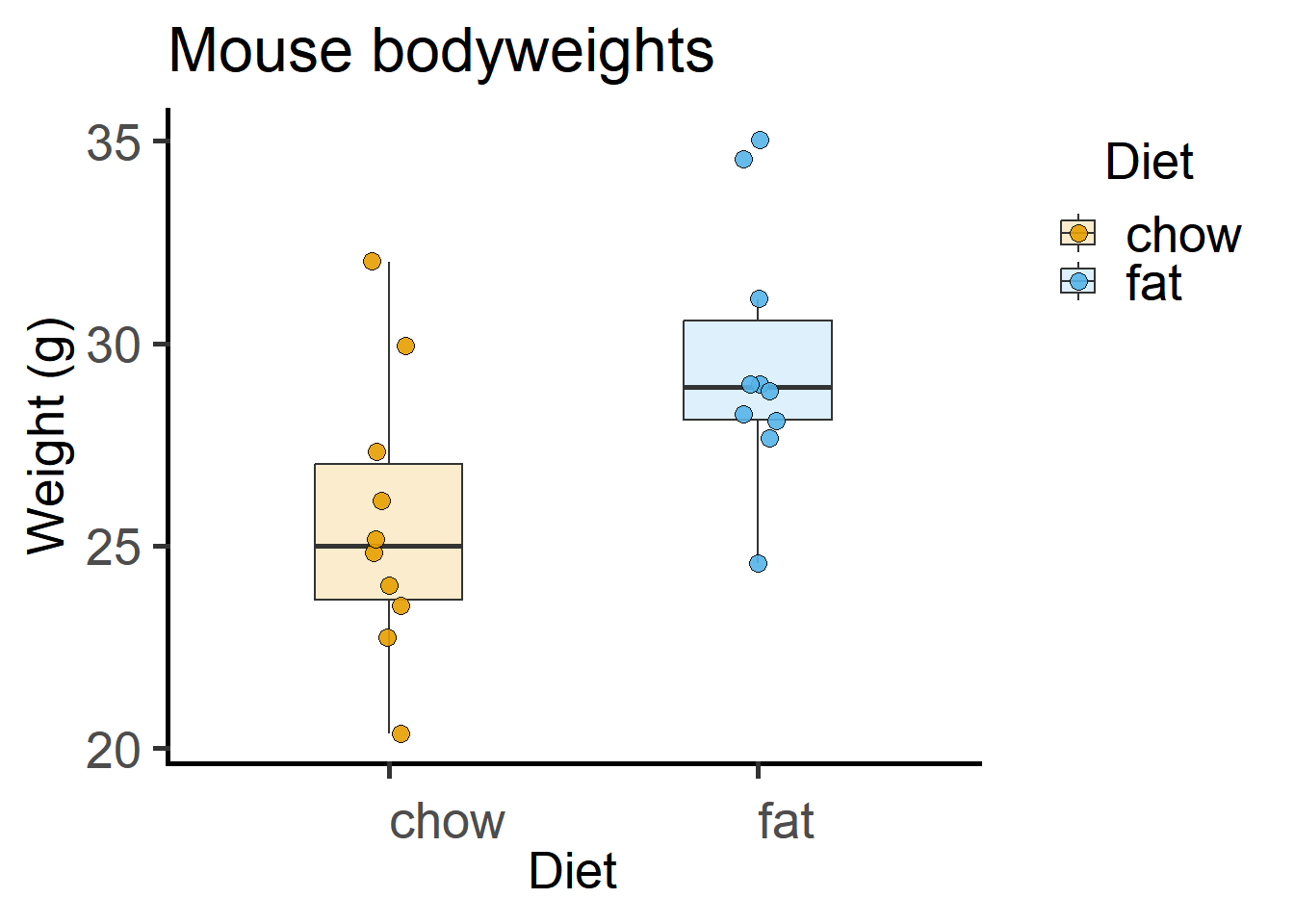
The above graph plotted with the grafify package, with fewer lines of code. More examples and customisations here.
library(grafify)
plot_scatterbox(Micebw,       #data table
                Diet,         #X variable
                Bodyweight)+  #Y variable
  labs(title = "Mouse bodyweights",  #plot title
       x = "Diet", y = "Weight (g)") #X & Y axis labels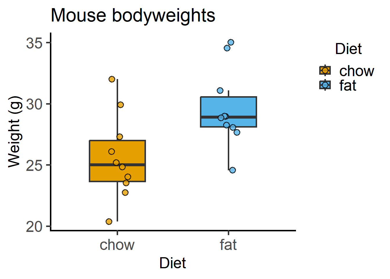
grafify.
4.1.2 Shapiro-Wilk test
In the case of a t test, checking the normality of residuals is the same as checking the normality of each group. This is not the case for ANOVAs, so it is better to get into the habit of checking the distribution of model residuals rather than data!
Shapiro-Wilk test can be used to check whether these data are roughly normally distributed. In this test the null hypothesis is that the data are normally distributed. If the P values are low, you can reject the null hypothesis.
In R, a way to “look-up” a section within these results is to use the $ operator. The p.value in a Shapiro-Wilk test can be selectively looked-up (without all the rest of the result) using $p.value, as in the result of the below.
Micebw %>% #data table "piped" to group_by function
  group_by(Diet) %>%  #grouped by Diet
  summarise(Shapiro_test = shapiro.test(Bodyweight)$p.value) #test result
# A tibble: 2 × 2
Diet Shapiro_test
<fct> <dbl>
1 chow 0.851
2 fat 0.1954.1.3 t test
The null hypothesis \(H_0\) of an independent-sample or unpaired t test is that the difference between the group means is 0 (i.e., the means are the same), and alternative \(H_1\) is that the difference is not 0 (i.e., the means are different).
The default for t.test is to apply Welch’s correction for unequal variance. Unless you are sure the variance between the groups is the same, do not override this.
t.test(Bodyweight ~ Diet, #formula y ~ predicted by ~ x
       data = Micebw) #data table
    Welch Two Sample t-test

data:  Bodyweight by Diet
t = -2.7046, df = 17.894, p-value = 0.01456
alternative hypothesis: true difference in means between group chow and group fat is not equal to 0
95 percent confidence interval:
 -7.1163969 -0.8924671
sample estimates:
mean in group chow  mean in group fat
          25.60446           29.60889
You can override this with var.equal = T (not recommended).
t.test(Bodyweight ~ Diet,
       data = Micebw,
       var.equal = T) #without Welch's correction
    Two Sample t-test

data:  Bodyweight by Diet
t = -2.7046, df = 18, p-value = 0.01451
alternative hypothesis: true difference in means between group chow and group fat is not equal to 0
95 percent confidence interval:
 -7.1150774 -0.8937866
sample estimates:
mean in group chow  mean in group fat
          25.60446           29.60889
4.1.4 The t test output
The first things to note are the t value and the Df. The t value is -2.7046, which does not appear to be too much of an outlier (recall that for the z distribution of large number of samples, \(\pm1.96\) are the cut-off for P < 0.05).
The Df is fractional with Welch’s correction (df = 17.894) because we were penalised for slightly difference variability within the two groups, and the net effect is that critical value cut-offs will be more conservative.
The P value is 0.01456.
Indeed, knowing the t value and Df you can get P values from look-up tables, online calculators or functions in R as below.
pt(-2.7046,
   df = 17.894)*2   #times 2 for two-tailed P value
[1] 0.01456133The null hypothesis is stated along with the confidence interval range of the difference between the means (-7.1163969 to -0.8924671). If the means were the same, the \(CI_{95}\) range will have included 0 in 95% repeated sampling. As 0 is outside the interval (only barely), the test is significant at the P < 0.05 cut-off!
The last line gives us the group means.
4.1.5 Reporting the t test
The technical way of reporting the result of a t test is to include the t value, degrees of freedom and the P value, indicating the type (e.g. whether it was an independent or paired), and the type of P value (e.g. one or two tailed).
Here we would say, the result of a two-tailed independent-groups Student’s t-test was as follows: t(17.894) = -2.7046; P = 0.01456.
Giving details this way gives a more clearer idea of how large the difference between groups was, the number of samples, and the P value based on these values. The t value and Df suggest that this result is “borderline” which one cannot infer simply from the P value.
4.1.6 t test as a linear model
The above analyses can also be done with lm (linear model) in R as follows. Use lm to save a linear model, perform model diagnostics by plotting a QQ plot and then use summary on the model to get the ANOVA table.
#fit and save a linear model
mice_lm <- lm(Bodyweight ~ Diet, #formula y ~ predicted by ~ x
              data = Micebw)     #data table

#plot a QQ plot of the model residuals
ggplot(fortify(mice_lm))+
  geom_qq(aes(sample = .stdresid),
          shape = 21,
          fill = graf_colours[[1]],
          size = 3)+
  geom_qq_line(aes(sample = .stdresid),
               size = 0.8)+
  labs(title = "QQ plot of residuals",
       x = "Theoretical", y = "Observed")+
  theme_grafify()
Warning: Using `size` aesthetic for lines was deprecated in ggplot2 3.4.0.
ℹ Please use `linewidth` instead.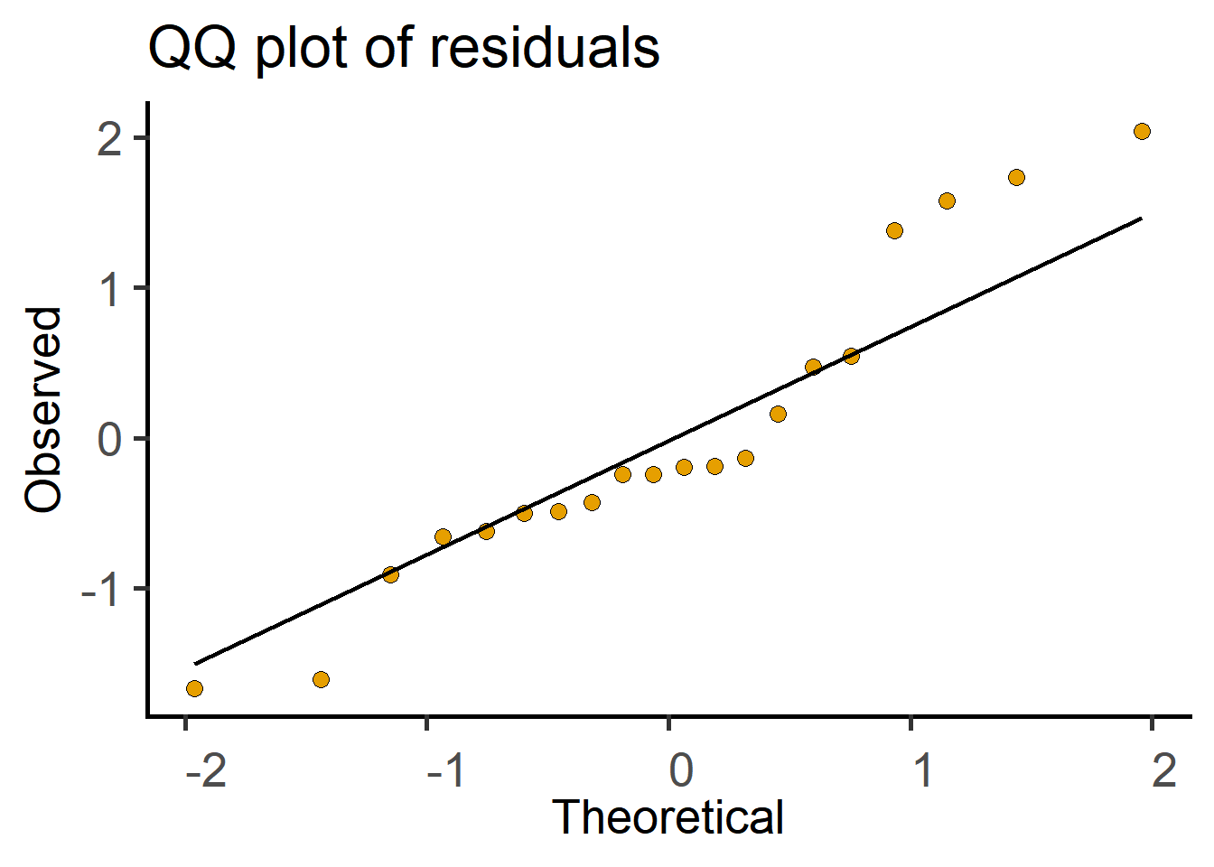
#get the F statistic and P values
anova(mice_lm)
Analysis of Variance Table
Response: Bodyweight
Df Sum Sq Mean Sq F value Pr(>F)
Diet 1 80.177 80.177 7.3148 0.01451 *
Residuals 18 197.298 10.961
---
Signif. codes: 0 '***' 0.001 '**' 0.01 '*' 0.05 '.' 0.1 ' ' 1Compare the result to the one from t.test above. For balanced designs (i.e., equal sample size in both groups), the F value is the square of the t value.
4.2 Paired t test - Cytokine data
We want to know whether wild type (WT) and knockout (KO) cells produce similar levels of a cytokine in vitro. There are two levels or groups (WT and KO) within the factor Genotype, and one dependent quantitative variable (Cytokine). Experiments were independently repeated n = 33 times, where WT and KO were measured side-by-side.
These data are therefore matched observations and “Experiment” is a random factor. The question can be rephrased as follows: is there a consistent difference between WT and KO across experiments. Note that the absolute level of the cytokine in each group matters less to us, as we are asking whether the two means differ consistently in each experiment (whether as a difference or ratio).
Therefore, the null hypothesis \(H_0\) is that the difference of pairs is 0 (or the ratio of paired observations is 1), and alternative \(H_1\) is that the difference between pairs is not 0 (or the ratio of paired observations is not 1).
I first show the paired ratio t test for these data, then the one-sample and the linear model analysis.
4.2.1 Data table
4.2.2 Exploratory plots
The code below is spread out to explain each line better.
ggplot(Cytokine, #data table
       aes(x = Genotype, #x aesthetic
           y = IL6) #y aesthetics
) +  #add geometries as you need
  geom_boxplot( #boxplot geometry
    outlier.alpha = 0,  #transparency = 100% for outliers
    width = 0.4)+ #width of boxes
  geom_point( #add scatter scatter plot geometry
    position = position_jitter(width = 0.05), #width of scatter plot
    aes(fill = Genotype), #colour aesthetic for scatter plot
    shape = 21,  #symbol type
    alpha = 0.7, #symbol transparency
    size = 3)+ #symbol size
  theme_grafify()+ #grafify theme
  labs(title = "Cytokine plot", #title
       x = "Genotype", y = "Cytokine (ng/mL)")+ #x & y labels
  scale_fill_grafify() #colour scheme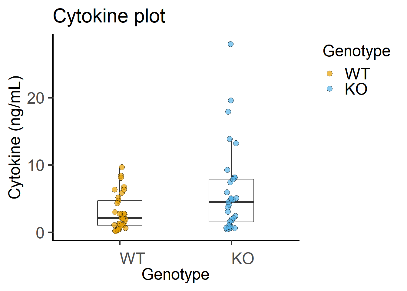
4.2.3 QQ plots
Data distribution can be visually checked using the geom_histogram or a combination of geom_qq and geom_qq_line to get Quantile-Quantile plots.
ggplot(Cytokine)+
  geom_histogram(binwidth = 4,
                 aes(x = IL6,
                     fill = Genotype))+
  facet_wrap("Genotype")+ #note the QQ plot looks better after log-transformation
  labs(title = "Histogram plot",
       x = "IL6 (bindwidth = 4)",
       y = "Counts")+
  scale_fill_grafify()+
  theme_grafify()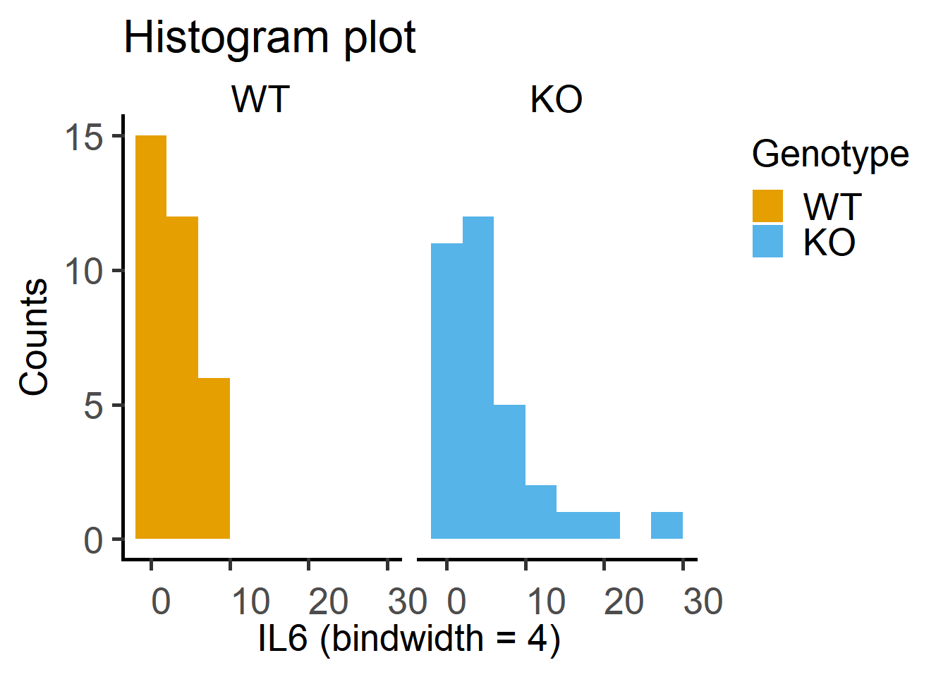
ggplot2
Here is a QQ plot of the data.
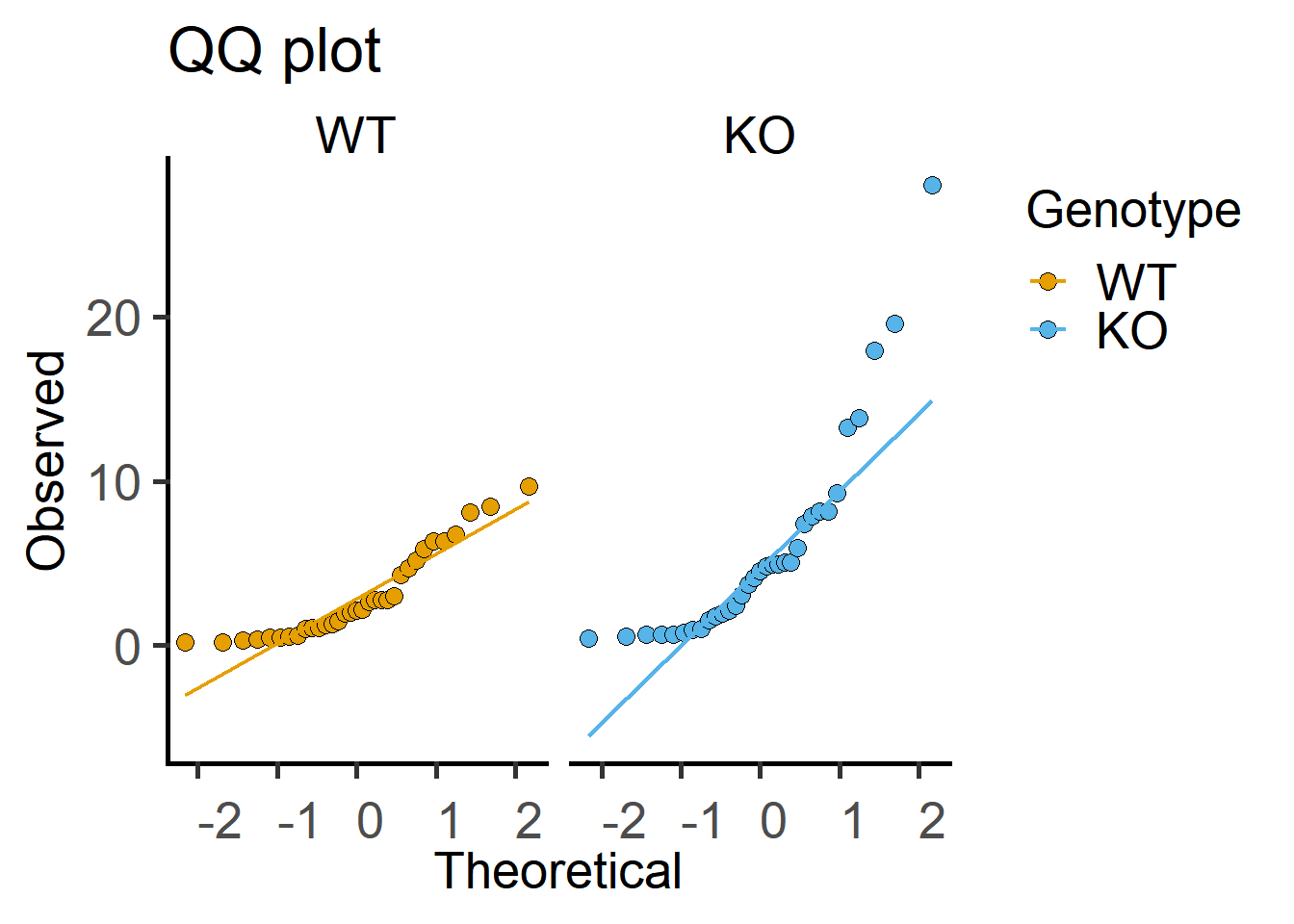
Both of the plots above can be generated with fewer lines of code in grafify.
4.2.4 Shapiro-Wilk test
Test on the Cytokine data below indicate data are log-normally distributed.
Cytokine %>%
  group_by(Genotype) %>%
  summarise(IL6.shap = shapiro.test(IL6)$p.value, #test of raw data
            Log.IL6.shap = shapiro.test(log10(IL6))$p.value) #test of log-data
# A tibble: 2 × 3
Genotype IL6.shap Log.IL6.shap
<fct> <dbl> <dbl>
1 WT 0.000933 0.194
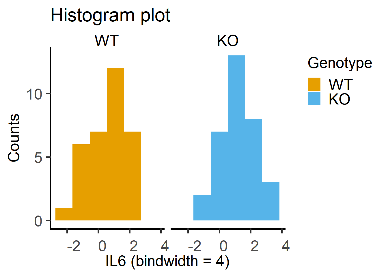
2 KO 0.0000174 0.268The histogram plot of log-transformed data. Note that these plots are more symmetrical around the centre.
ggplot2
Here is the QQ plot with log-transformed data, which shows more match between observed and theoretical (fitted) values.
ggplot(Cytokine)+
  geom_qq(aes(sample = log(IL6), #qq dotplot of log-IL6
              fill = Genotype),
          shape = 21,            #symbol shape for fill colour
          size = 3)+           #symbol size
  geom_qq_line(aes(sample = log(IL6), ##qq lineplot with IL6 as sample
                   colour = Genotype),
               size = 0.8)+      #line thickness
  facet_wrap("Genotype")+ #separate graphs by genotypes
  labs(title = "QQ plot of log-data",
       x = "Theoretical", y = "Observed")+
  scale_fill_grafify()+
  scale_colour_grafify()+
  theme_grafify()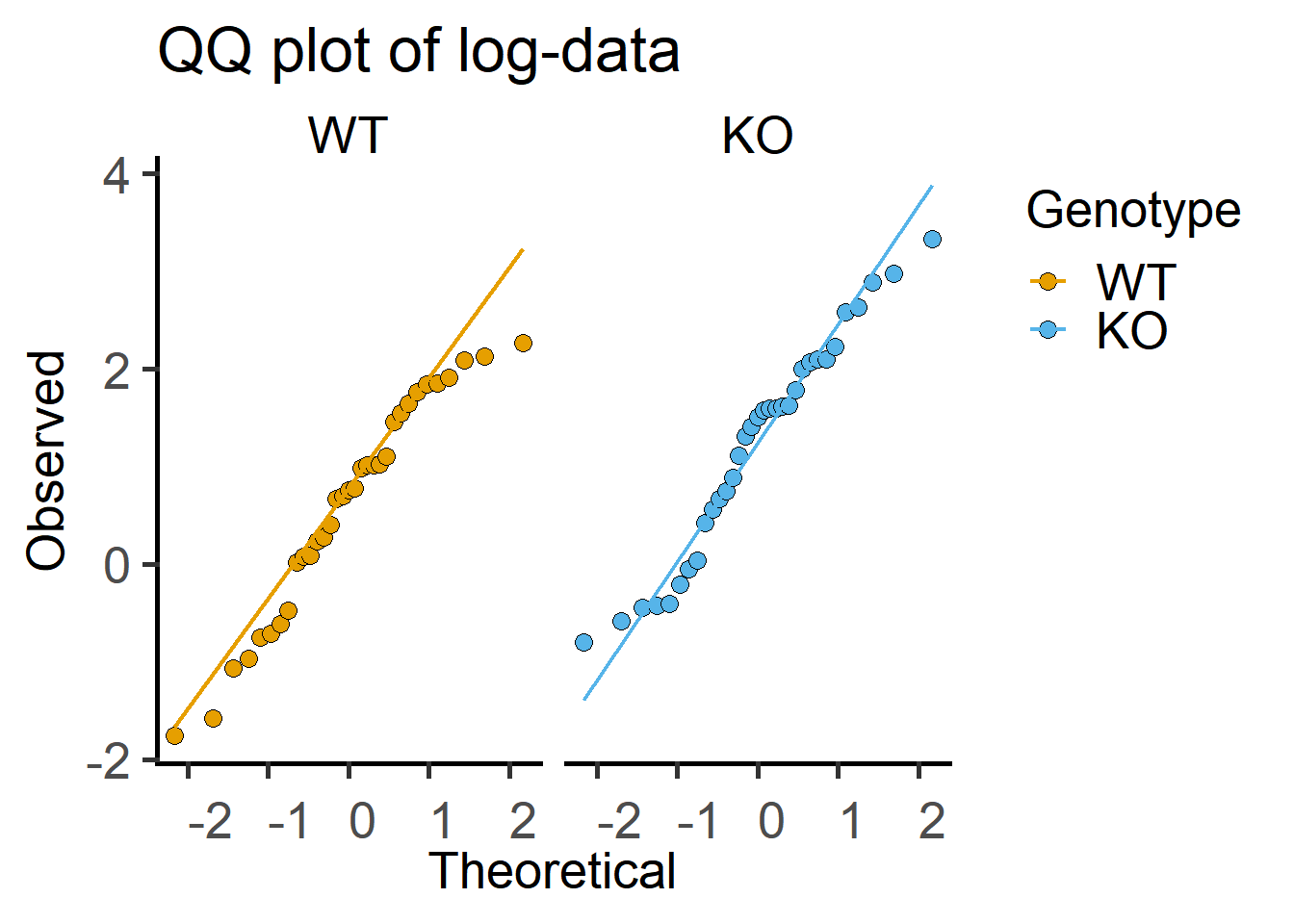
Plot of data on log-Y scale shows log-distributed data more clearly. Compare the code below to that with grafify with log transformation.
ggplot(Cytokine, #data table
       aes(x = Genotype, #x aesthetic
           y = IL6,
           group = Experiment) #y aesthetics
) +  #add geometries as you need
  geom_boxplot(aes(fill = Genotype,   #fill colour by Genotype
                   group = Genotype), #group by Genotype
               outlier.alpha = 0,  #transparency = 100% for outliers
               width = 0.4,   #box width
               alpha = 0)+    #box transparency
  geom_point( aes(fill = Genotype), #colour aesthetic for symbols
              position = position_dodge(width = 0.1), #dodge
              alpha = 0.9, #symbol transparency
              shape = 21,  #symbol type 21
              size = 4)+   #symbol size
  theme_grafify()+ #grafify theme
  labs(title = "Cytokine plot", #title
       x = "Genotype",
       y = "Cytokine (ng/mL)")+ #x & y labels
  scale_fill_grafify()+ #colour scheme
  scale_y_log10()+ #show these values on Y
  annotation_logticks(sides = "l") #show log-ticks on "left" axis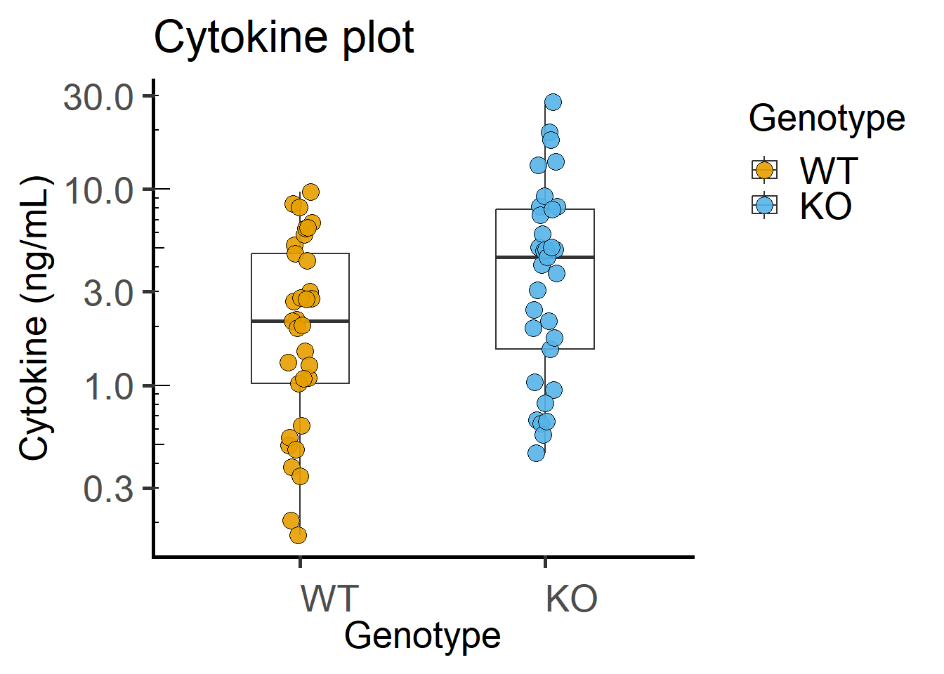
Paired plot or before-after plot shows that in most cases the value in the WT is less than the KO. The code below has an additional geom_line geometry that joins symbols by the variable Experiment in the data table.
ggplot(Cytokine, #data table
       aes(x = Genotype, #x aesthetic
           y = IL6,
           group = Experiment) #y aesthetics
) +  #add geometries as you need
  geom_boxplot(aes(fill = Genotype,   #fill colour by Genotype
                   group = Genotype), #group by Genotype
               outlier.alpha = 0,  #transparency = 100% for outliers
               width = 0.4,   #box width
               alpha = 0)+    #box transparency
  geom_point( aes(fill = Genotype), #colour aesthetic for symbols
              position = position_dodge(width = 0.1), #dodge
              alpha = 0.9, #symbol transparency
              shape = 21,  #symbol type 21
              size = 4)+   #symbol size
  geom_line(aes(group = Experiment), #join points by Experiment
            position = position_dodge(width = 0.1),  #same as for geom_point
            colour = "grey55", #colour of lines
            alpha = 0.6)+      #transparency of lines
  theme_grafify()+ #grafify theme
  labs(title = "Before-after plot", #title
       x = "Genotype",
       y = "Cytokine (ng/mL)")+ #x & y labels
  scale_fill_grafify()+ #colour scheme
  scale_y_log10()+ #show these values on Y
  annotation_logticks(sides = "l") #show log-ticks on "left" axis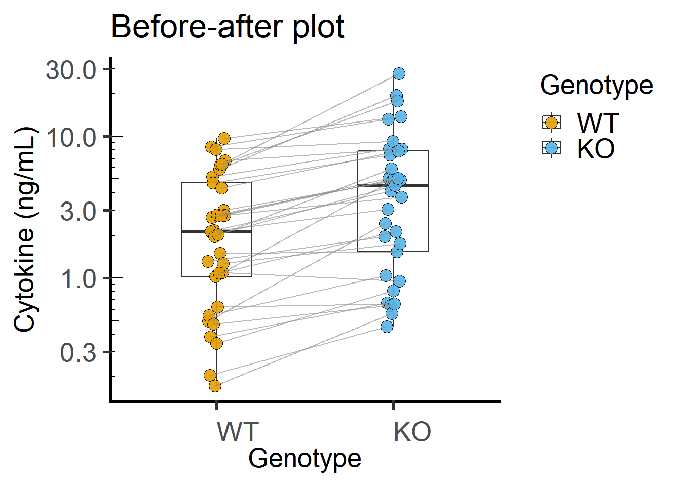
4.2.5 Paired t test
4.2.6 Student’s paired ratio t-test
As the data are log-normally distributed, we will perform a paired ratio t test on log-transformed data (indicated in the formula syntax). Note that results (mean and SD etc.) will be on log-scale, and will need to be back-transformed to the original scale of the raw data.
As these data are paired, we set paired = T (default is paired = F). After a new update to t.test, this only works with wide tables with paired observations on a row. If you don’t want to do it this way, use linear models with long table as below.
First convert the long-table into wide-format using the pivot_wider function from the tidyr package. Also see Appendix.
Cytowide <- Cytokine %>%
  pivot_wider(id_cols = Experiment, #column that will define rows
              names_from = Genotype, #separate WT & KO into columns
              values_from = IL6) #create a wide table
Cytowide$Ratio <- log(Cytowide$WT) - log(Cytowide$KO) #calculate the ratio for the test
datatable(Cytowide,  #dynamic table
          caption = "Wide table of cytokine data.")
Then run the paired t test as follows.
t.test(log(Cytowide$WT), #log transformed group 1
       log(Cytowide$KO), #log transformed group 2
       paired = TRUE)    #paired t-test
    Paired t-test

data:  log(Cytowide$WT) and log(Cytowide$KO)
t = -8.299, df = 32, p-value = 1.758e-09
alternative hypothesis: true mean difference is not equal to 0
95 percent confidence interval:
 -0.7808986 -0.4731092
sample estimates:
mean difference
     -0.6270039
4.2.7 The paired t test output
The first things to note are the t value and the Df. The t value is 8.299, which is rather large (recall that for the z distribution of large number of samples, \(\pm1.96\) are the cut-off for P < 0.05).
The Df is 32 because we had 33 pairs from 66 values.
The P value is 1.758e-09, which is rather low.
Indeed, knowing the t value and Df you can get P values from look-up tables, online calculators or functions in R as below.
pt(8.299,
   lower.tail = F,
   df = 32)*2  #times 2 for two-tailed P value
[1] 1.758135e-09The alternative hypothesis is stated, which we could accept given the result, that the difference between means is not zero. Note that the test is not enough to know that we have performed a paired ratio test even though we used
log()transformation in the formula.The confidence interval of the difference between the means (0.4731092 to 0.7808986) is given, which looks narrow and excludes 0. The test is significant at the P < 0.05 cut-off!
The last line gives us the difference between means of log values.
4.2.8 Reporting the paired t test
Here we would say, the result of a two-tailed paired-ratio Student’s t-test was as follows: t(32) = 8.299; P = 1.758e-09.
4.2.9 One-sample t test
A paired ratio t test we performed above is actually a one-sample t test under the hood. In a one-sample t test we compare whether our observed values are different from a chosen number (mu in the t.test, default is mu = 0).
As we want to test ratios, we use the subtraction of log-transformed values = 0. We will test whether \(log(\frac {WT}{KO}) = log(1) = 0\) (the alternative \(\ne 0\)).
First calculate the log-ratios as below by using the wide-format table we made above.
#create a new column Ratio
Cytowide$Ratio <- log(Cytowide$WT) - log(Cytowide$KO) #calculate the ratio for the test
datatable(Cytowide,  #dynamic table
          caption = "Wide table of cytokine data.")
In the t.test function, the default is mu = 0 (difference between group means), but I have set it explicitly below and provided the data column containing the ratios. The result is exactly the same as above.
t.test(Cytowide$Ratio, #the column you want to test
       mu = 0) #value you want to test the difference from
    One Sample t-test

data:  Cytowide$Ratio
t = -8.299, df = 32, p-value = 1.758e-09
alternative hypothesis: true mean is not equal to 0
95 percent confidence interval:
 -0.7808986 -0.4731092
sample estimates:
 mean of x
-0.6270039
Note the result is identical to the one we got with paired ratio t-test above. By calculating ratios for the test, we have effectively “normalised” data within each experiment (calculated fold-change of Cytokine values in WT compared to KO). All values for the WT group have “got used up” (we lose degrees of freedom), and we are left with only 33 values (the ratios). The Df is therefore 33 – 1 = 32.
4.2.10 Reporting the paired t test
Here we would say, the result of a two-tailed one-sample Student’s t-test was as follows: t(32) = 8.299; P = 1.758e-09.
Caution
Note that we should not compare ratios we calculated in a two-sample t test with the column of WT values (which will all be 1 in this case), which will make R think there are 33 WT values and 33 KO values (that are actually ratios we calculated!). This will artificially inflate Df and look up a less conservative t distribution when calculating P values. As WT values are “used up” for calculating ratios and will all be 1 with an SD of 0, which violates the normal distribution and should not be used!
4.2.11 Linear mixed effects analysis
The same data can be analysed with “Experiment” as a random factor using the lme4 or lmerTest packages. For this analyses, the lmerTest package should be loaded first because the lme4 package does not give P values in the ANOVA table (but this is implemented in the lmerTest package. Results will be like an ANOVA table, which I explain below. The formula includes the random factor term. The code below is with the package lme4, some of which is also implemented in grafify for lineaar models.
The lmer() call fits a linear mixed effect model based on the data and formula we provide, and the summary() call gives us the slopes, SE, intercepts, variance etc. More commonly, we will look at the ANOVA table (next section) that gives us the F statistic and the P value.
Cyto_lmer <- lmer(log(IL6) ~ Genotype + #formula as Y ~ X
                    (1|Experiment), #random factor
                  data = Cytokine) #data table

summary(Cyto_lmer) #summary of the model
Linear mixed model fit by REML. t-tests use Satterthwaite's method ['lmerModLmerTest']
Formula: log(IL6) ~ Genotype + (1 | Experiment)
Data: Cytokine
REML criterion at convergence: 141.8
Scaled residuals:
Min 1Q Median 3Q Max
-1.6760 -0.4769 0.0095 0.4272 1.6004
Random effects:
Groups Name Variance Std.Dev.
Experiment (Intercept) 1.18115 1.0868
Residual 0.09418 0.3069
Number of obs: 66, groups: Experiment, 33
Fixed effects:
Estimate Std. Error df t value Pr(>|t|)
(Intercept) 0.59840 0.19659 34.45022 3.044 0.00445 **
GenotypeKO 0.62700 0.07555 32.00000 8.299 1.76e-09 ***
---
Signif. codes: 0 '***' 0.001 '**' 0.01 '*' 0.05 '.' 0.1 ' ' 1
Correlation of Fixed Effects:
(Intr)
GenotypeKO -0.1924.2.11.1 The lme4 output: summary()
As you see the result looks long and complicated, but it’s really not and we only need to look at a few things from it. I’m only going to discuss some of the output here; a (slightly) more detailed summary is given here for linear models.
The formula for the model being fit is given at the start with spread of residuals around 0.
The details for the random factor (Experiment) give the variance across Experiments, which is 1.18115 in this case.
The variance that is unexplained by our model is the residual error or residual variance – which will be very low if our model fits our data well! In this case it is 0.09418, which is much lower than that across Experiments (Residual SD is 0.3069). This variance contributes to the \(noise\), which you see if low because we were able to carve out the variance across Experiments by attributing it to the random factor.
The number of “obs” (observations) and “groups” are useful for keeping track of Df. We have 66 observations in 33 Experiments.
The section below has the details of the fixed factor (Genotype) that we want to compare. I set WT as the first of the two groups in the data table using
fct_relevel(from the Tidyverseforcats()package), otherwiselmer()will use the group with the name that is alphabetically the first). Just as we did here in Chapter 3, the WT was given a “dummy” numerical X value of 0, so the mean of this group is the value of the Intercept in the Estimate column (0.59840 – note that in this case this is the mean of the (log) of the WT group because we transformed the data in thelmer()formula).The slope (also called coefficient) and its SE for the KO (“dummy” X = 1) are given by the row labelled GenotypeKO in the Estimate column (0.62700) and Std.err (0.07555) columns, respectively. The ratio of the two is the t statistic, which is similar to the results from the t test above (t value 8.299, Df 32 and P value 1.76e-09).
The Df of 32, which also matches above result.
The
Pr(>|t|)means the probability for a t value at least a large as the absolute value (recall that the distribution is symmetric with +ve and -ve values in the tail, therefore the notation for absolute value).The \(y = mx + c \pm error\) equation can be used to predict the values of Y (logIL6) when X is KO using the value of the overall intercept (mean of WT) + slope \(\pm\) residual error to generate the 33 values we have observed. If our model fit is good, our predictions will be close to observed values.
4.2.11.2 ANOVA table from lme4
Let’s get the ANOVA table using the anova() call.
anova(Cyto_lmer, #lmer() model
      type = "II") #type II sum of squares - recommended
Type II Analysis of Variance Table with Satterthwaite's method
Sum Sq Mean Sq NumDF DenDF F value Pr(>F)
Genotype 6.4867 6.4867 1 32 68.873 1.758e-09 ***
---
Signif. codes: 0 '***' 0.001 '**' 0.01 '*' 0.05 '.' 0.1 ' ' 1Each row of the ANOVA table represents a fixed factor – there is just one factor here Genotype.
Remember that in ANOVA we use variances (square of SD) so the F statistic is always positive.
The ANOVA table gives us the values of the sum of squares (Sum Sq) between groups. The mean sum of squares (MeanSq) is calculated by dividing the Sum Sq by the numerator degrees of freedom. In this case Sum Sq and Mean Sq are the same because we have 2 groups and the numDf = 2 – 1 = 1. This value is the \(signal\) of the F statistic (6.4867).
The variance that contributes to \(noise\) is the unexplained residual variance (0.09148 from the
summary()above).The ratio of \(signal/noise\) is the F statistic: \(6.4867/0.09418 = 68.873\).
To reiterate, the larger observed variance (1.18115) is attributed to the random factor “Experiment”, which we don’t care about. So the unexplained variance (residual variance) that contributes to \(noise\) is lower.
The next column denominator Df (which affects the \(noise\) and is derived based on all observations \(n\) and groups, subjects, random factors etc.).
We want to know whether our observed F value is an outlier in the ideal F distribution with NumDf and DenDf degrees of freedom. The chance of obtaining an F value at least as extreme is the P value. The larger the F value, the more of an outlier it is. In this case, 68.873 is a pretty large \(signal/noise\) ratio and therefore our result is “significant” and has a low P value (it’s the same as we got from the t test!
Note: For t tests between groups that have equal variances (i.e. without applying Welch’s correction), the F value is t2, which we can confirm in this case as follows:
#Square of t = F

(-8.299)^2
[1] 68.8734P values from F can be calculated by look up tables or functions. We will need two degrees of freedom, for numerator and denominator. Here the numerator has just 2 groups (Df = 1) and denominator has 66 observations in 33 experimental groups (Df = 32). The P value is very low.
pf(68.973,           #pf function in base R
   df1 = 1,
   df2 = 32,
   lower.tail = F)
[1] 1.730228e-094.2.12 Reporting the ANOVA result
The technical way of reporting the result of an ANOVA is to include the F value, both degrees of freedom and the P value.
Here we would say, the result of a one-way ANOVA using linear mixed effects for the factor Genotype was as follows: F(1, 32) = 68.873; P = 1.758e-09.
These details of the F value and Dfs clearly tells us how many groups were compared and how many total observations were made, and lets the reader get a better idea of the experimental design and the result i.e. how large the \(signal/noise\) was based on the total number of samples and groups, and the associated P value. This large F value suggests that the factor “Genotype” has a “major” effect on Cytokine.
In this particular case we only had two groups and we won’t do post-hoc comparisons, which we encounter in the next Chapter.
4.2.13 Model residuals
A longer discussion on checking whether our model is a good fit to data is in Chapter 5) in the section on model diagnostics. Here, we check residuals of our linear model using ggResidanel package by running resid_panel on the linear model object Cyto_lmer we saved earlier.
resid_panel(Cyto_lmer)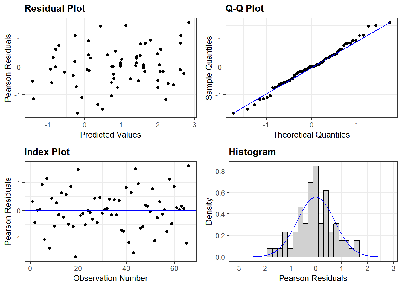
The random scatter of residuals in the Residual & Index plots, and an acceptable QQ plot and roughly central distribution of residuals in the Histogram plot, suggest that the model is a good fit and reliable. Recall that this is because we used log-transformed data.
See the model below for non-transformed data. Log-transformation is better for this analyses as our model residuals show closer to normal distribution. grafify can also generate a QQ plot from model residuals.
resid_panel(lmer(IL6 ~ Genotype + #formula as Y ~ X
                   (1|Experiment), #random factor
data = Cytokine))4.3 Analysis with grafify
The grafify package I created offers a ‘user interface’ to ggplot2 and lme4 so that most of the analyses above needs fewer lines of code. For example, the Student’s t test can be solved as a linear model using the following steps.
- fit a model to the data
- diagnose whether the model residuals are approximately normally distributed
- generate an ANOVA table with the F and P values.
4.3.1 Simple linear models in grafify
library(grafify)
#fit a simple linear model and save it
mice_lm_graf <- simple_model(data = Micebw,
                             Y_value = "Bodyweight",
                             Fixed_Factor = "Diet")

#check model residuals
plot_qqmodel(Model = mice_lm_graf)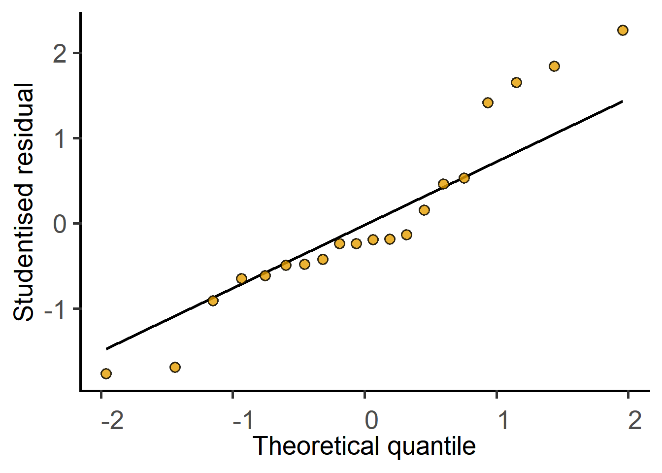
#get the result table
simple_anova(data = Micebw,
             Y_value = "Bodyweight",
             Fixed_Factor = "Diet")
Anova Table (Type II tests)
Response: Bodyweight
Sum Sq Mean sq Df F value Pr(>F)
Diet 80.177 80.177 1 7.3148 0.01451 *
Residuals 197.298 10.961 18
---
Signif. codes: 0 '***' 0.001 '**' 0.01 '*' 0.05 '.' 0.1 ' ' 1Compare results with the t test result above.
4.3.2 Mixed models in grafify
The steps are the same, but slightly functions for mixed effects linear models.
#fit a mixed effects model
cyto_lm_graf <- mixed_model(data = Cytokine,      #data table
                            Y_value = "log(IL6)",    #log of Y variable
                            Fixed_Factor = "Genotype",    #fixed factor
                            Random_Factor = "Experiment")  #random factor

#check model distribution
plot_qqmodel(Model = cyto_lm_graf)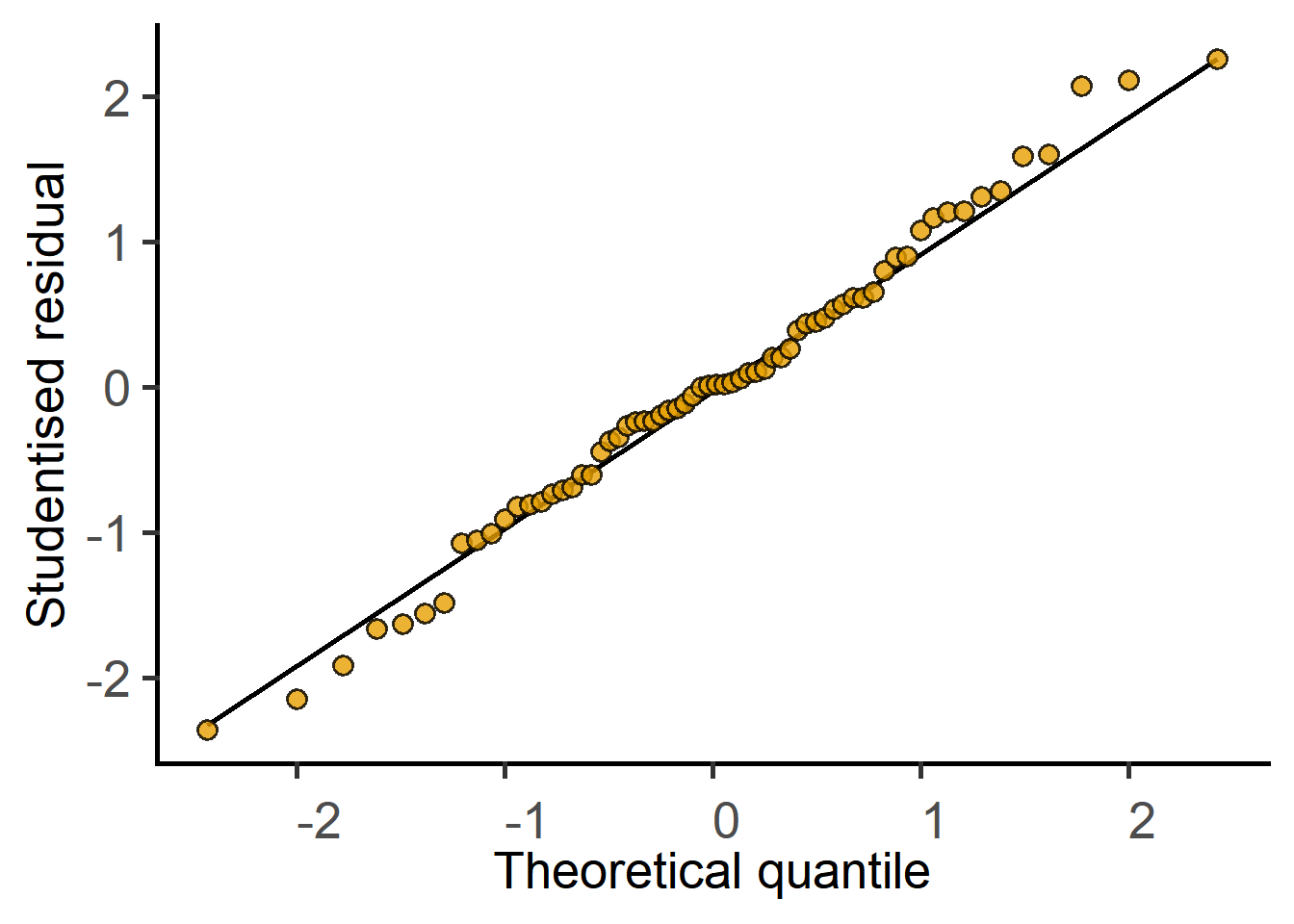
#get ANOVA table
mixed_anova(data = Cytokine,      #data table
            Y_value = "log(IL6)",    #log of Y variable
            Fixed_Factor = "Genotype",    #fixed factor
            Random_Factor = "Experiment")  #random factor
Type II Analysis of Variance Table with Kenward-Roger's method
Sum Sq Mean Sq NumDF DenDF F value Pr(>F)
Genotype 6.4867 6.4867 1 32 68.873 1.758e-09 ***
---
Signif. codes: 0 '***' 0.001 '**' 0.01 '*' 0.05 '.' 0.1 ' ' 1Once again, compare results with the analysis in lme4 above.
Further details on the dedicated grafify vignette website.