| Treatment | Time | Subject | Cytokine |
|---|---|---|---|
| Control | Week_1 | Con_W1_Ms1 | 12.78 |
| Control | Week_1 | Con_W1_Ms2 | 11.14 |
| Control | Week_1 | Con_W1_Ms3 | 11.41 |
| Control | Week_2 | Con_W2_Ms1 | 9.81 |
| Control | Week_2 | Con_W2_Ms2 | 8.19 |
| Control | Week_2 | Con_W2_Ms3 | 10.86 |
| Drug | Week_1 | Drug_W1_Ms1 | 20.64 |
| Drug | Week_1 | Drug_W1_Ms2 | 18.57 |
| Drug | Week_1 | Drug_W1_Ms3 | 18.61 |
| Drug | Week_2 | Drug_W2_Ms1 | 17.90 |
| Drug | Week_2 | Drug_W2_Ms2 | 18.72 |
| Drug | Week_2 | Drug_W2_Ms3 | 19.81 |
7 Repeated measures design
7.1 Mixed model anlysis of repeated-measures data
We use lme4 instead of traditional repeated-measures or within-subjects design using aov(). Before proceeding with analysis of your own data, ensure that your data table is in the correct format and categorical variables are encoded as factors and not numbers. Here are the packages needed for these analyses.
These data are from in vitro experiments measuring percentage cell death after infection. Each “Subject” (experimental well) was measured at 2 time points. Cells were one of two genotypes: WT or KO (knockout). We want to know whether cell death changes over time and whether this is different between the genotypes.
As side-by-side experiments on the two genotypes for two time points were carried out several times independently, “Exp” is a random factor and allowed its own intercept.
“Subject” is also a random factor because we are not interested only in these subjects, which were randomly sampled, and want to be able to generalise over all subjects. We also allow subjects to have their own intercepts.
Note the specific requirements of the long-format data table. Each row must uniquely indicate Genotype, Time, Subject and PI value. This table has explicit “nesting” of subjects i.e. subject IDs are unique taking into account the whole experiment.
Df for this experiment are more complicated as shown below.
7.1.0.1 A note on entering IDs for Subjects
The ID of the “Subject” or “Individual” should be carefully chosen and should be unique considering the whole dataset. In R, I strongly recommend using alphanumeric IDs wherever possible. When total Df (denDf) is calculated, we lose Df for number of unique subjects in the study – incorrect or confusing IDs of subjects will result in wrong Df and P values.
Let’s say we want to measure a parameter at weeks 1 and 2 in Control & Drug-treated mice. We could do this by using 6 different mice in each group, and measure 3 per group at week 1 (e.g. by sacrificing them to harvest tissue) and 3 at week 2. Here we have 6 “subjects” per group (12 total). This kind of data are entered in Table 7.1), where “names” of mice in week 1 and week 2 are different to indicate these are 6 unique subjects per group. Alternatively, we may have a non-invasive measurement technology and use the exact same mice at week 1 and 2. In this case, we will have 3 “subjects” per group (6 total) as entered in Table Table 7.2. Here the “names” of mice used in week 1 and 2 are the same within Treatment groups. Making subject IDs or names explicitly unique is good-practice and will precisely describe the experimental design so that R does not make a mistake in fitting an incorrect model and calculate wrong denDf.
| Treatment | Time | Subject | Cytokine |
|---|---|---|---|
| Control | Week_1 | Con_Ms1 | 12.78 |
| Control | Week_1 | Con_Ms2 | 11.14 |
| Control | Week_1 | Con_Ms3 | 11.41 |
| Control | Week_2 | Con_Ms1 | 9.81 |
| Control | Week_2 | Con_Ms2 | 8.19 |
| Control | Week_2 | Con_Ms3 | 10.86 |
| Drug | Week_1 | Drug_Ms1 | 20.64 |
| Drug | Week_1 | Drug_Ms2 | 18.57 |
| Drug | Week_1 | Drug_Ms3 | 18.61 |
| Drug | Week_2 | Drug_Ms1 | 17.90 |
| Drug | Week_2 | Drug_Ms2 | 18.72 |
| Drug | Week_2 | Drug_Ms3 | 19.81 |
The easiest way to do avoid confusion over how many subjects were repeatedly measured is to make “subject IDs” alphanumeric and unique taking into account how you designed the study.
In the data we process in this Chapter I used Subject IDs s1-s12, which describe 6 “individuals” each of WT and KO (i.e., 12 different subjects). Each of them is measured repeatedly (i.e., at two time points), which is why this study is a repeated measures design.
Another thing to note about these data is that they are also designed as randomised blocks of “Experiment” – there are 6 experiments e1 - e6. Each subject only appears only within an experimental block i.e., Subject s1 was used in Experiment e1, but does not appear again in other Experimental blocks. The exact same individual does not appear in other blocks in the study design. The technical way of describing this is that our subjects are nested within experiments. This is clear from the way we have labelled subjects and experiments in Table Table 7.3 below.
7.1.1 Cell death table
| X | Experiment | Time | Subject | Genotype | PI | Time2 |
|---|---|---|---|---|---|---|
| 1 | e1 | t100 | s01 | WT | 20.47 | 100 |
| 2 | e2 | t100 | s02 | WT | 28.89 | 100 |
| 3 | e3 | t100 | s03 | WT | 11.55 | 100 |
| 4 | e4 | t100 | s04 | WT | 23.25 | 100 |
| 5 | e5 | t100 | s05 | WT | 30.21 | 100 |
| 6 | e6 | t100 | s06 | WT | 28.68 | 100 |
| 7 | e1 | t100 | s07 | KO | 9.34 | 100 |
| 8 | e2 | t100 | s08 | KO | 7.60 | 100 |
| 9 | e3 | t100 | s09 | KO | 5.48 | 100 |
| 10 | e4 | t100 | s10 | KO | 8.26 | 100 |
| 11 | e5 | t100 | s11 | KO | 6.98 | 100 |
| 12 | e6 | t100 | s12 | KO | 3.87 | 100 |
| 25 | e1 | t300 | s01 | WT | 38.14 | 300 |
| 26 | e2 | t300 | s02 | WT | 38.10 | 300 |
| 27 | e3 | t300 | s03 | WT | 23.17 | 300 |
| 28 | e4 | t300 | s04 | WT | 32.19 | 300 |
| 29 | e5 | t300 | s05 | WT | 44.01 | 300 |
| 30 | e6 | t300 | s06 | WT | 48.81 | 300 |
| 31 | e1 | t300 | s07 | KO | 13.41 | 300 |
| 32 | e2 | t300 | s08 | KO | 9.77 | 300 |
| 33 | e3 | t300 | s09 | KO | 7.83 | 300 |
| 34 | e4 | t300 | s10 | KO | 10.18 | 300 |
| 35 | e5 | t300 | s11 | KO | 12.63 | 300 |
| 36 | e6 | t300 | s12 | KO | 7.34 | 300 |
7.1.2 Exploratory plots of cell death
Note that the data table has a “factor” column of time that is alphanumeric and a “numeric” column. For ANOVAs, factors should always be categorical – keep in mind that R by default will assume numbers a quantitative and the fit will be different! You must use a column with factor type data for ANOVA (see Figure 7.1), and a different numerical one if you want to plot these same data against Time on a quantitative X-axis as in Figure 7.3.
ggplot(PITime,
       aes(x = Time,
           y = PI))+
  geom_boxplot(aes(fill = Genotype),
               width = 0.4,
               alpha = 0.7,
               position = position_dodge(width = 0.7))+ #dodge the variables Genotype & Time
  geom_point(aes(fill = Genotype),
             shape = 21,
             size = 3,
             alpha = 0.8,
             position = position_jitterdodge(jitter.width = 0.1,
                                             dodge.width = 0.7))+
  theme_grafify()+
  scale_fill_grafify()+
  labs(title = "Cell death over time",
       y = "Cell death (%)")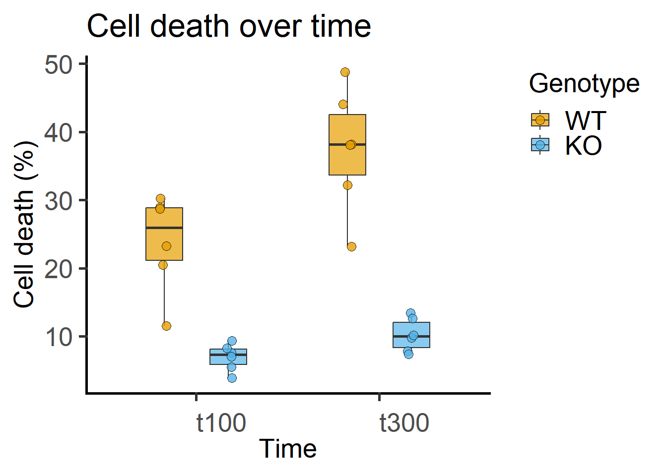
Data separated by experiment and subject.
ggplot(PITime,
       aes(x = Time,
           y = PI))+
  geom_point(aes(shape = Subject,
                 colour = Genotype),
             size = 3,
             stroke = 1,
             alpha = 0.8)+
  geom_line(aes(group = Genotype))+
  theme_grafify(base_size = 15)+
  scale_fill_grafify()+
  scale_colour_grafify()+
  guides(colour = guide_legend(order = 1),
         shape = guide_legend(order = 2))+
  theme(legend.justification = "right")+
  scale_shape_manual(values = 0:20)+
  facet_wrap("Experiment")+
  labs(title = "Cell death plotted across Experiments",
       y = "Cell death (%)")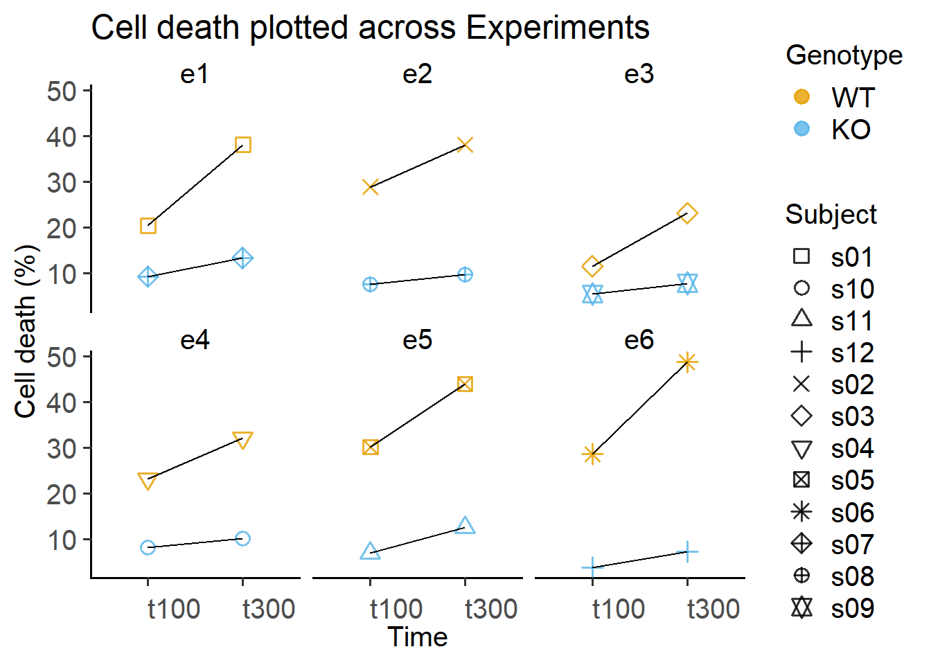
ggplot(PITime,
       aes(x=Time2,
           y=PI,
           group=interaction(Genotype,
                             Time2)))+
  geom_smooth(aes(group = Genotype,
                  colour = Genotype),
              method = "lm",
              alpha = 0.2)+
  geom_boxplot(aes(fill = Genotype),
               width = 10,
               alpha = 0.6,
               position = position_identity())+
  geom_jitter(width = 2,
              size = 3,
              shape = 21,
              alpha = 0.7,
              aes(fill = Genotype))+
  theme_grafify()+
  scale_fill_grafify()+
  scale_colour_grafify()+
  labs(title = "Cell death vs (numeric) Time",
       x = "Time (min)",
       y = "Cell death (%)")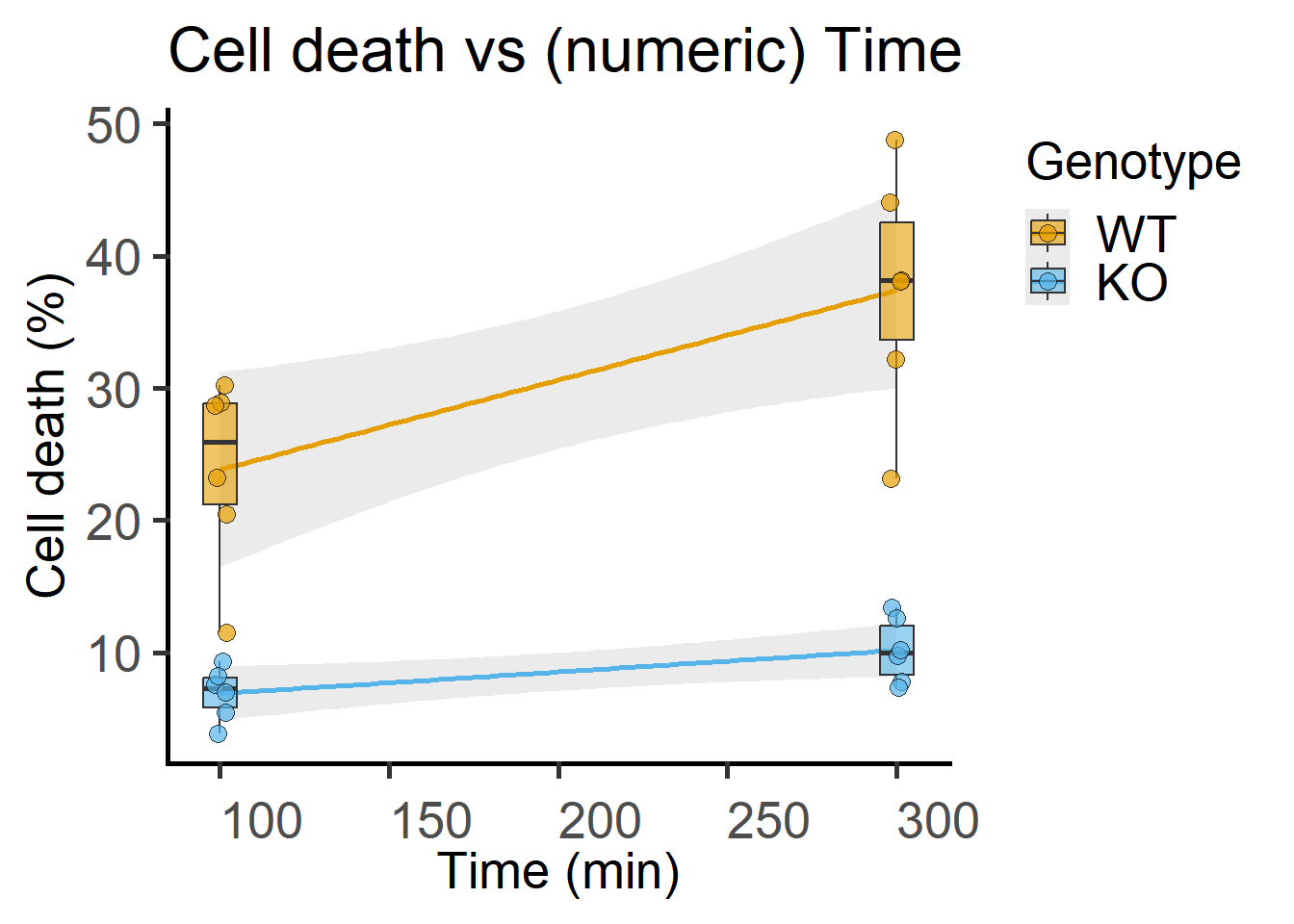
7.2 Mixed model analysis of cell death
Here, Death is the quantitative dependent variable, which is in percentage, so could be divided by 100 and transformed using the \(logit\) transformation to shift its probability distribution towards the normal distribution. Time & Geno are predictors (i.e. fixed factors). The data table above, Time2 is a numeric Time column for plotting the graph in Figure 7.3. Subject is measured repeatedly, so we allow intercepts for this random factor. Note that WT subjects & KO subjects have different names because they are NOT the same “individuals”. Experiments are part of the block design, so we also allow random intercepts for “Experiment” (another random factor).
PITlmer <- lmer(logit(PI/100) ~ Genotype * Time + #formula including logit transformation
                  (1|Subject) + (1|Experiment), #random intercepts
                data = PITime)

summary(PITlmer)
Linear mixed model fit by REML. t-tests use Satterthwaite's method ['lmerModLmerTest']
Formula: logit(PI/100) ~ Genotype * Time + (1 | Subject) + (1 | Experiment)
Data: PITime
REML criterion at convergence: 11.4
Scaled residuals:
Min 1Q Median 3Q Max
-1.10277 -0.66524 0.08805 0.61831 1.00022
Random effects:
Groups Name Variance Std.Dev.
Subject (Intercept) 0.112894 0.33600
Experiment (Intercept) 0.006409 0.08005
Residual 0.020186 0.14208
Number of obs: 24, groups: Subject, 12; Experiment, 6
Fixed effects:
Estimate Std. Error df t value Pr(>|t|)
(Intercept) -1.20604 0.15247 11.52247 -7.910 5.45e-06 ***
GenotypeKO -1.43165 0.21062 5.83467 -6.797 0.000559 ***
Timet300 0.67255 0.08203 10.00000 8.199 9.49e-06 ***
GenotypeKO:Timet300 -0.23506 0.11601 10.00000 -2.026 0.070238 .
---
Signif. codes: 0 '***' 0.001 '**' 0.01 '*' 0.05 '.' 0.1 ' ' 1
Correlation of Fixed Effects:
(Intr) GntyKO Tmt300
GenotypeKO -0.691
Timet300 -0.269 0.195
GntyKO:T300 0.190 -0.275 -0.7077.2.1 Comparing models
In the model above, we had two random intercepts: Subject for the repeated measures, and Experiment to account for the block design. When we look at the Random effects section of the model summary, we see that Subject has the highest Std.Dev of 0.336, which is more than that of the Residual at 0.14208. Interestingly, Experiment has a very low value, suggesting that after accounting for nested subjects, Experiment accounts for very little noise in the study. This random intercept could be dropped to simplify the model.
We can compare models with the package performance. But we need to fit models with REML = FALSE.
#same model as above with two intercepts
mod_SubExp_ints <- lmer(logit(PI/100) ~ Genotype * Time + #formula including logit transformation
                          (1|Subject) + (1|Experiment), #random intercepts
                        data = PITime,
                        REML = FALSE)

#model with Subject intercept only
mod_Sub_ints <- lmer(logit(PI/100) ~ Genotype * Time + #formula including logit transformation
                          (1|Subject), #random intercepts
                        data = PITime,
                        REML = FALSE)

#model with Experiment intercept only
mod_Exp_ints <- lmer(logit(PI/100) ~ Genotype * Time + #formula including logit transformation
                          (1|Experiment), #random intercepts
                        data = PITime,
                        REML = FALSE)

#compare them
modcomps <- performance::compare_performance(mod_SubExp_ints,
                                 mod_Sub_ints,
                                 mod_Exp_ints,
                                 rank = TRUE) #rank them
Some of the nested models seem to be identical and probably only vary in their random effects.Following indices with missing values are not used for ranking: AIC_wt, AICc_wt, BIC_wt#mod_Sub_ints ranks as best
modcomps# Comparison of Model Performance Indices
Name | Model | R2 (cond.) | R2 (marg.) | ICC | RMSE | Sigma | Performance-Score
-------------------------------------------------------------------------------------------------------
mod_Sub_ints | lmerModLmerTest | 0.980 | 0.859 | 0.855 | 0.095 | 0.130 | 97.23%
mod_SubExp_ints | lmerModLmerTest | 0.980 | 0.859 | 0.855 | 0.095 | 0.130 | 80.00%
mod_Exp_ints | lmerModLmerTest | 0.904 | 0.859 | 0.316 | 0.258 | 0.282 | 20.00%#plot the result
plot(modcomps) #larger values better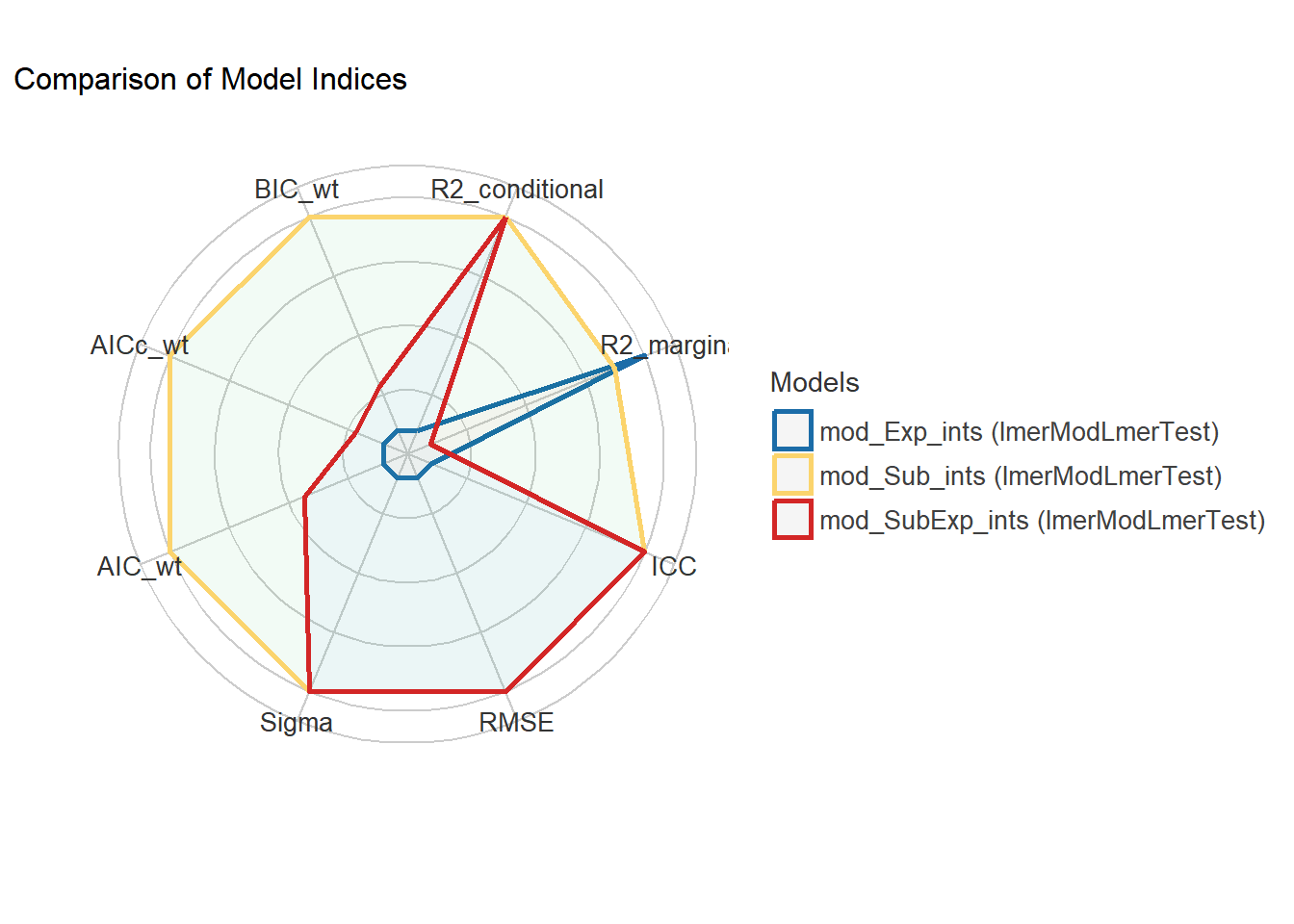
Paying attention to random effects in the summary output is useful! In this case, as subjects are nested within experiments, just one random factor does quite well to increase power of the analyses. In other cases, with a lot more data, both random factors could be fit or more complex models tested.
Before proceeding with the model further, we need to re-fit it with REML = TRUE.
mod2_Sub_ints <- lmer(logit(PI/100) ~ Genotype * Time + #formula including logit transformation
                          (1|Subject), #random intercepts
                        data = PITime)
7.2.2 Model diagnostics
As before, we will use ggResidpanel for diagnostic plots.
resid_panel(mod2_Sub_ints)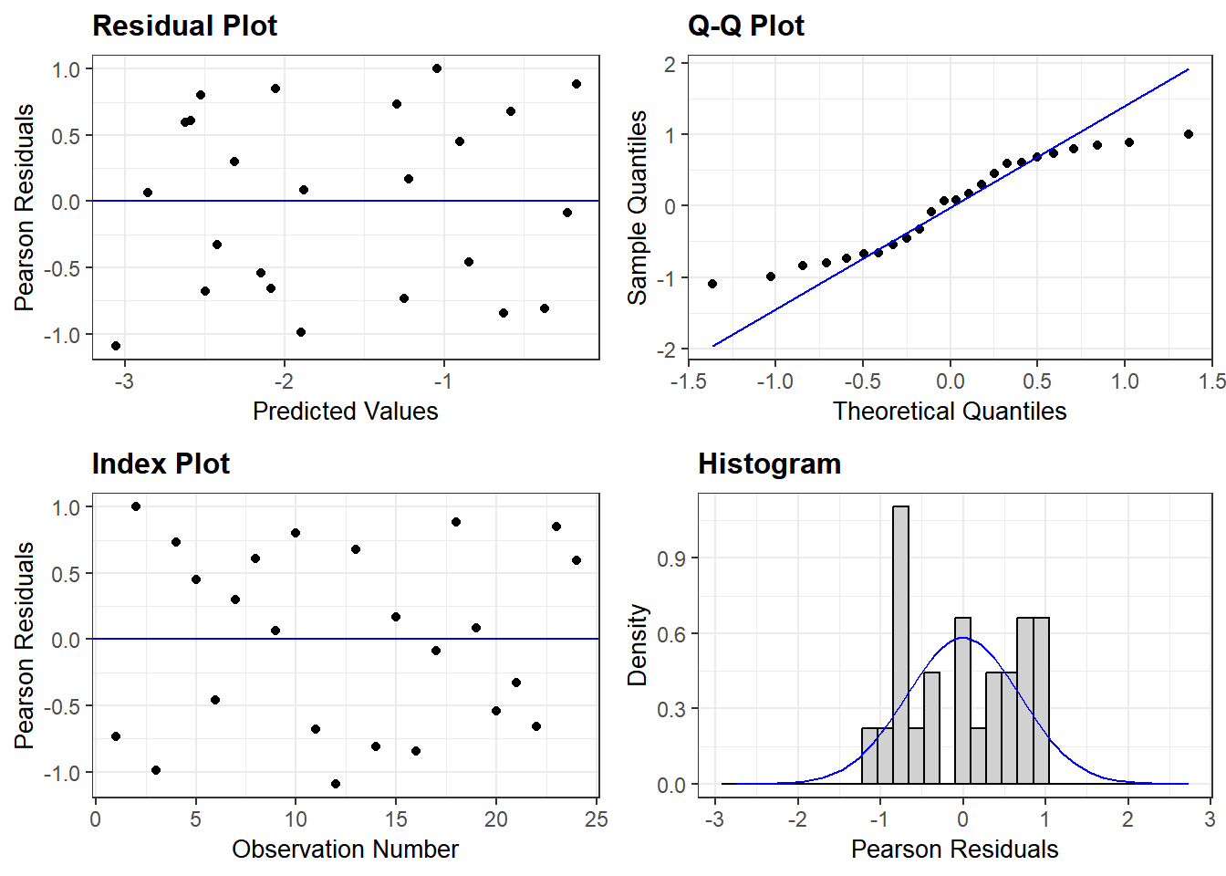
7.2.3 ANOVA table
Get the ANOVA table with the anova() call on the lmer model.
anova(mod2_Sub_ints,
      type ="II")
Type II Analysis of Variance Table with Satterthwaite's method
Sum Sq Mean Sq NumDF DenDF F value Pr(>F)
Genotype 1.12319 1.12319 1 10 55.6425 2.161e-05 ***
Time 1.84830 1.84830 1 10 91.5646 2.377e-06 ***
Genotype:Time 0.08288 0.08288 1 10 4.1059 0.07024 .
---
Signif. codes: 0 '***' 0.001 '**' 0.01 '*' 0.05 '.' 0.1 ' ' 1See discussion in Chapter 4 on how to read the summary() of ANOVA model and how the ANOVA table is generated. This is a two way ANOVA and the result for each factor is on a new row. The interaction between Genotype and Time is indicated by the : colon between the two in the table (the lmer formula syntax uses * in the formula above). If Time has the same effect at every level of Genotype, there is no interaction. If the effect is different, there is interaction. In the ANOVA table the F values for fixed factors are large (~59 and ~92) – these are very large \(signal/noise\) ratios indeed! The interaction between Time and Genotype is a bit doubtful at F value ~4.
Because the denominator Df calculation is difficult and is an approximation, you should pay attention to the F value itself (recall that the P value is calculated based on Df values). The method used for Df calculation can change the P value but not the F. Ask yourself whether the observed F value is a large value that could be an outlier in the distribution?
The default method of approximately calculating the Df (in lmerTest which provides the functionality to the anova call above) is Satterthwaite’s method. This can be changed to Kenward-Roger (which is more conservative and sometimes recommended for unbalanced designs, i.e., when number of observations in different groups is not the same) as shown below. Results with both methods is same for balanced designs like this dataset.
anova(mod2_Sub_ints,
      type ="II",
      ddf = "Kenward-Roger") #preferred (more conservative) Df approximation
Type II Analysis of Variance Table with Kenward-Roger's method
Sum Sq Mean Sq NumDF DenDF F value Pr(>F)
Genotype 1.12319 1.12319 1 10 55.6425 2.161e-05 ***
Time 1.84830 1.84830 1 10 91.5646 2.377e-06 ***
Genotype:Time 0.08288 0.08288 1 10 4.1059 0.07024 .
---
Signif. codes: 0 '***' 0.001 '**' 0.01 '*' 0.05 '.' 0.1 ' ' 1See Chapter 5 for how to report ANOVA results](#ANOVA-one-report).
7.3 Post-hoc comparisons of cell death
Pairwise comparisons of Genotypes separately at each level of Time.
emmeans(mod2_Sub_ints,
        pairwise ~Genotype|Time,
        adjust = "fdr",
        type = "response")
$emmeans
Time = t100:
Genotype response SE df lower.CL upper.CL
WT 0.2304 0.0270 11.6 0.1766 0.2948
KO 0.0668 0.0095 11.6 0.0487 0.0908
Time = t300:
Genotype response SE df lower.CL upper.CL
WT 0.3697 0.0355 11.6 0.2958 0.4502
KO 0.0997 0.0137 11.6 0.0735 0.1339
Degrees-of-freedom method: kenward-roger
Confidence level used: 0.95
Intervals are back-transformed from the logit scale
$contrasts
Time = t100:
contrast odds.ratio SE df null t.ratio p.value
WT / KO 4.19 0.903 11.6 1 6.639 <.0001
Time = t300:
contrast odds.ratio SE df null t.ratio p.value
WT / KO 5.29 1.140 11.6 1 7.730 <.0001
Degrees-of-freedom method: kenward-roger
Tests are performed on the log odds ratio scale 7.3.1 Approx Df calculations
This is clearer if you fill out the checkerboard table of observations and means to see how many Df you lose for Subjects. This can be seen from summary of the lmer() model. In table above in the Fixed Effects section, (Intercept) is KO t100 (alphabetically the first group in the table), GenoWT is the t100 of Geno and so on.
It is also useful to think in terms of ‘once 6 subjects KO t100 are allowed to have their own intercepts’, how many remaining degrees of freedom are available to get the mean for KO?
Calculations by hand are messy and won’t give fractional Df seen in tables above.
\(signal\) Df for Genotype = 2 – 1 = 1
\(signal\) Df for Time = 2 – 1 = 1
Df for Subjects = 12 - 1 = 11
Df for Experiments = 6 – 1 = 5
Total Df = 24 – 1 = 23
You lose Df for Subjects, so \(noise\) Df = 23 – 11 – 1 – 1 = 10
Time is measured within-subjects, and there are interactions between Time & Genotype to calculate. This IS messy (read more here), but in the least you should ensure that your model does not give you unrealistically large noise or denominator Df.
A large denDf will give you an extreme P value because it will look up a less conservative F distribution. Therefore, focus on the F statistic for each factor and remember that with very large \(n\) the critical values at P < 0.05 are \(\pm\) 1.96. This can be problem with pseudo-replicates.
7.3.2 Changing Df settings in lmer() and emmeans()
Typically you won’t need to change denDf options as different methods may give similar results for simple designs. This is for information only.
The recommendation is to load the lmerTest package before running lmer() to fit the model, and then using the anova() call to get the ANOVA table.
In lme4, the ddf = option lets you change the method for denDf approximation. The default method “Satterthwaite”, can be changed to “Kenward-Roger” or “lme4” (which gives you only F values as originally implemented by the authors of lme4).
The default in emmeans is Kenward-Roger, and can also be changed using the lmer.df setting to satterthwaite: see here and here.
7.4 Repeated measures in grafify
The idea is the same as above – grafify offers intercept only models, which is what we will do to allow intercepts for each Subject. Please see further details on the grafify vignette website for ordinary ANOVA and mixed models.
#fit a model
graf_2w_rep <- mixed_model(data = PITime,
                           Y_value = "logit(PI/100)",
                           Fixed_Factor = c("Genotype",
                                            "Time"),
                           Random_Factor = "Subject")
#QQ plot of residuals
plot_qqmodel(Model = graf_2w_rep)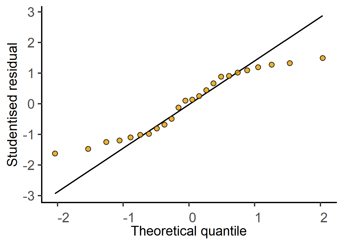
grafify#ANOVA table
mixed_anova(data = PITime,
Y_value = "logit(PI/100)",
Fixed_Factor = c("Genotype",
"Time"),
Random_Factor = "Subject")Type II Analysis of Variance Table with Kenward-Roger's method
Sum Sq Mean Sq NumDF DenDF F value Pr(>F)
Genotype 1.12319 1.12319 1 10 55.6425 2.161e-05 ***
Time 1.84830 1.84830 1 10 91.5646 2.377e-06 ***
Genotype:Time 0.08288 0.08288 1 10 4.1059 0.07024 .
---
Signif. codes: 0 '***' 0.001 '**' 0.01 '*' 0.05 '.' 0.1 ' ' 1#post-hoc comparisons
posthoc_Levelwise(Model = graf_2w_rep,
Fixed_Factor = c("Genotype",
"Time"))$emmeans
Time = t100:
Genotype response SE df lower.CL upper.CL
WT 0.2304 0.0270 11.6 0.1766 0.2948
KO 0.0668 0.0095 11.6 0.0487 0.0908
Time = t300:
Genotype response SE df lower.CL upper.CL
WT 0.3697 0.0355 11.6 0.2958 0.4502
KO 0.0997 0.0137 11.6 0.0735 0.1339
Degrees-of-freedom method: kenward-roger
Confidence level used: 0.95
Intervals are back-transformed from the logit scale
$contrasts
Time = t100:
contrast odds.ratio SE df null t.ratio p.value
WT / KO 4.19 0.903 11.6 1 6.639 <.0001
Time = t300:
contrast odds.ratio SE df null t.ratio p.value
WT / KO 5.29 1.140 11.6 1 7.730 <.0001
Degrees-of-freedom method: kenward-roger
Tests are performed on the log odds ratio scale