plot_scatterbox(Micebw,      #data table
                Diet,        #X variable
                Bodyweight,  #Y variable
                b_alpha = 0.2)+ #box opacity
  labs(title = "Mouse body weights")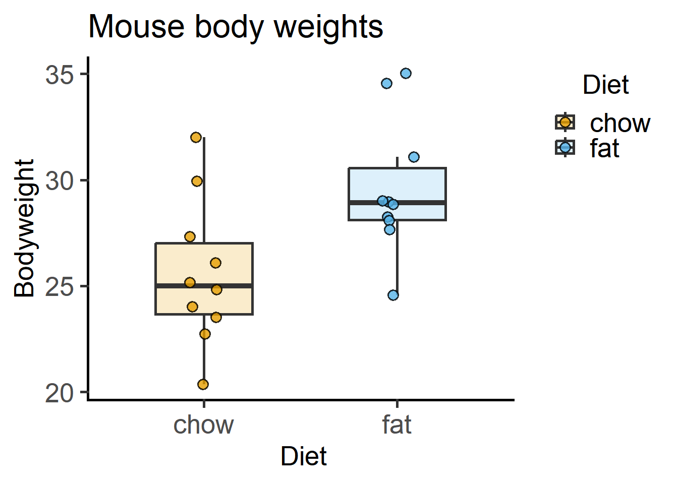
grafify packagegrafify packageThe grafify package simplifies R for repeatedly plotting graphs while exploring data. It also performs ANOVAs and post-hoc comparisons using linear models. grafify also contains datasets similar to those used in this document.
Download and install grafify from CRAN or GitHub.
Examples of graphs and analyses with grafify are shown in this Chapter. Visit to the grafify vignettes website for a full list of features and instructions.
If you use grafify, please cite
Shenoy, A. R. (2021) grafify: an R package for easy graphs, ANOVAs and post-hoc comparisons. Zenodo. http://doi.org/10.5281/zenodo.5136508
Latest DOI for all versions: ![]()
grafifyHere are examples of bar and box plots with grafify that are similar to those in Chapter 4), for example Figure 4.1). Their main feature is the brevity of code, which is especially useful when exploring data and being able to plot graphs quickly.
All plot functions require a data table, variables xcol and ycol to plot along the X- and Y-axis, respectively. If this order is followed, argument names can be skipped.
plot_scatterbox(Micebw, #data table
Diet, #X variable
Bodyweight, #Y variable
b_alpha = 0.2)+ #box opacity
labs(title = "Mouse body weights")Below is a graph of cytokines data on a semi-log plot as in Figure 4.9. Log-transformation is available as an argument in plot_ functions.
plot_scatterbox(Cytokine,        #data table
                Genotype,        #X variable
                IL6,             #Y variable
                b_alpha = 0,     #box opacity
                LogYTrans = "log10")+ #log10-transformation
  labs(title = "Cytokines plot",
       y = "Cytokine (ng/mL)")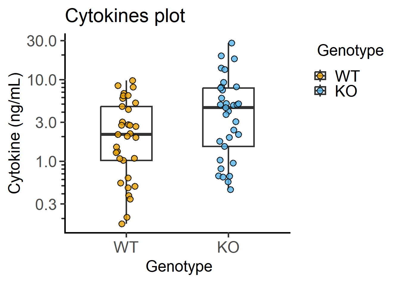
Data with matching are often depicted with lines joining matched data. This is similar to Figure 4.10, but with much shorter code in grafify.
#matched data with box
plot_befafter_box(Cytokine, #data table
Genotype, #X variable
IL6, #Y variable
Experiment, #matching variable
LogYTrans = "log10")+ #log10-transform
labs(title = "Machted box plot")
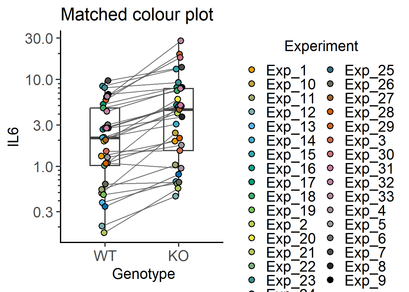
#matching by colour of symbols
plot_befafter_colours(Cytokine, #data table
Genotype, #X variable
IL6, #Y variable
Experiment, #matching variable
LogYTrans = "log10", #log10 transform
fontsize = 18, #font size
Boxplot = TRUE) + #default is FALSE
labs(title = "Matched colour plot")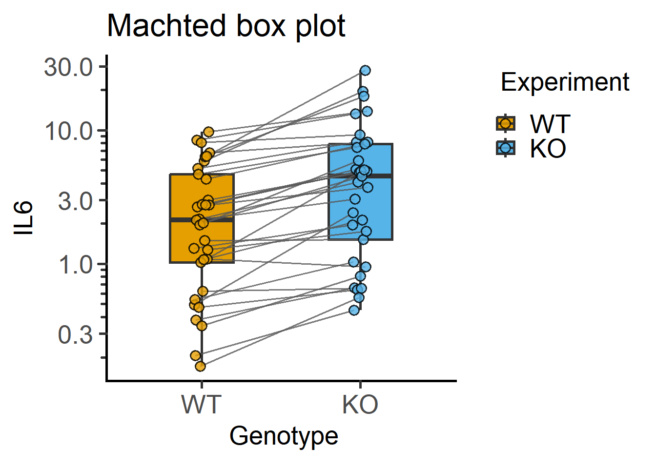
These functions can also be used to join data within the same experiment to generate a plot like in Figure 5.3.
plot_befafter_shapes(data = Bact,        #data table
                     xcol = Genotype,    #X variable
                     ycol = Death,       #Y variable
                     match = Experiment, #matching variable
                     facet = Experiment, #factor for faceting
                     fontsize = 18)+     #font size
  labs(title = "Experiment-wise matched plot")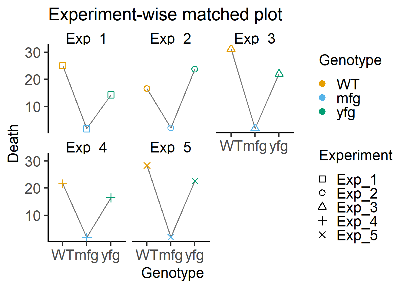
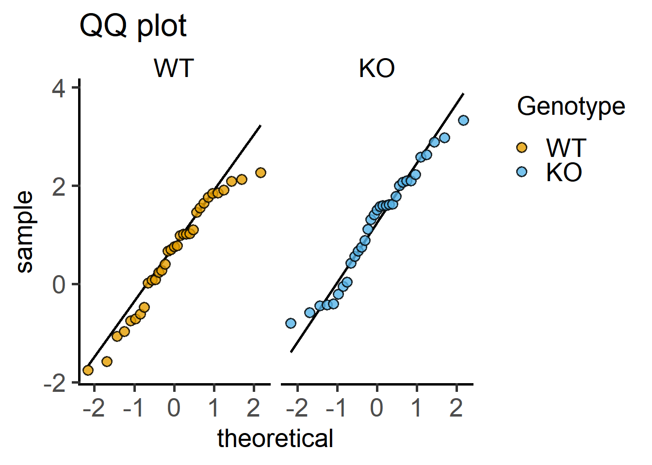
Here are QQ and histogram plots to assess data distribution similar to Figure 4.7) and Figure 4.6.
#histograms
plot_histogram(data = Cytokine,   #data
               ycol = log(IL6),   #transformed Y variable
               group = Genotype,  #fixed factor for grouping
               facet = Genotype)+ #factor for faceting
  labs(title = "Histogram plot")
#qqplot
plot_qqline(data = Cytokine,      #data
            ycol = log(IL6),      #transformed Y variable
            group = Genotype,     #fixed factor for grouping
            facet = Genotype)+    #factor for faceting
  labs(title = "QQ plot")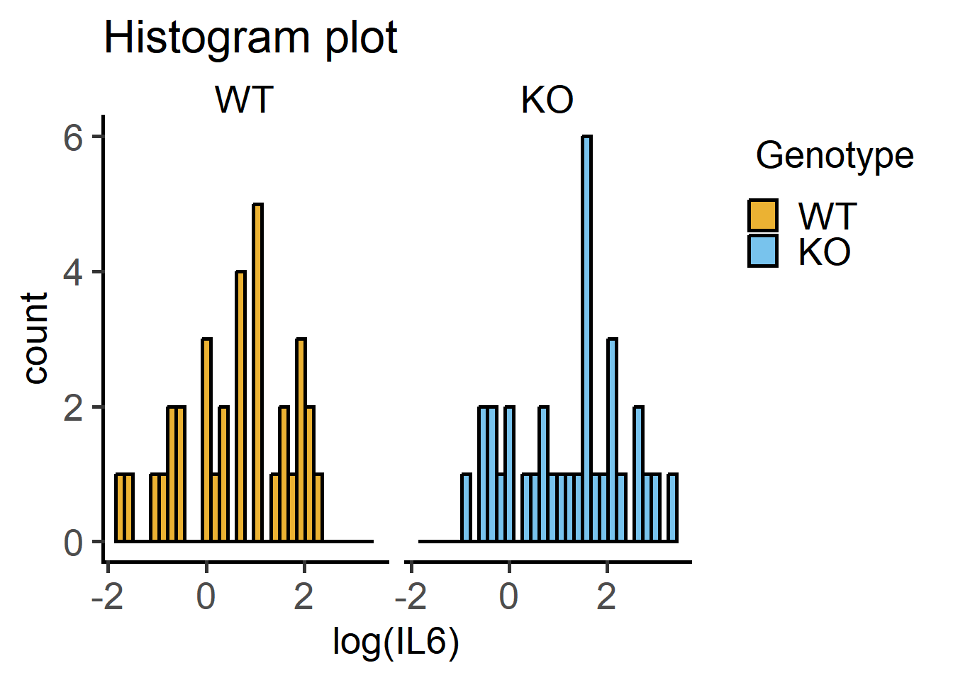
These functions make it easy to plot symbols where the shape of the symbols matches each experiment or block (can be changed to any other variable if you like).
This example below is similar to Figure 5.2.
plot_3d_scatterbar(Bact,           #data table
                   Genotype,       #X variable
                   Death,          #Y variable
                   Experiment)+    #random factor
  labs(title = "One-way ANOVA with randomised blocks")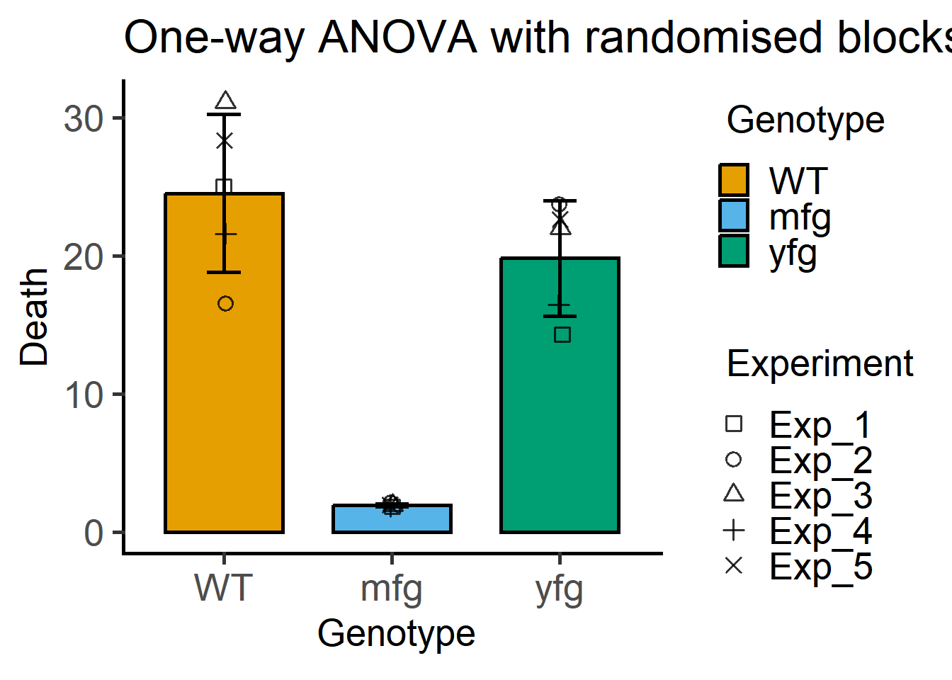
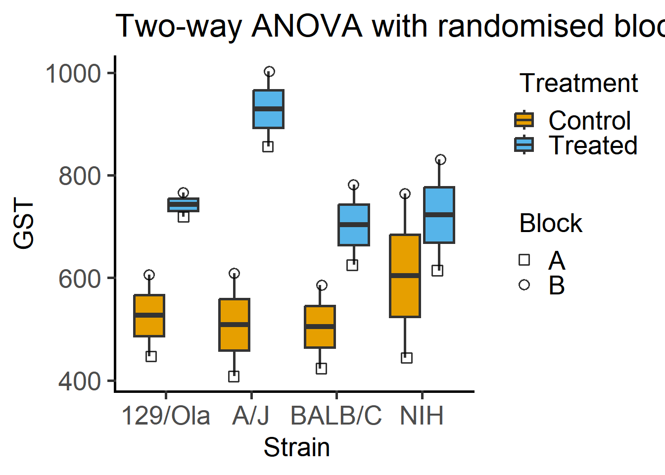
Here is a plot of 2-way ANOVA designs which needs far less code with grafify than Figure 6.1.
#bar graph
plot_4d_scatterbar(Mice,        #data table
                   Strain,      #X variable
                   GST,         #fixed factor 1
                   Treatment,   #fixed factor 2
                   Block)+      #random factor
  labs(title = "Two-way ANOVA with randomised blocks")
#box plot
plot_4d_scatterbox(Mice,        #data table
                   Strain,      #X variable
                   GST,         #fixed factor 1
                   Treatment,   #fixed factor 2
                   Block)+      #random factor
  labs(title = "Two-way ANOVA with randomised blocks")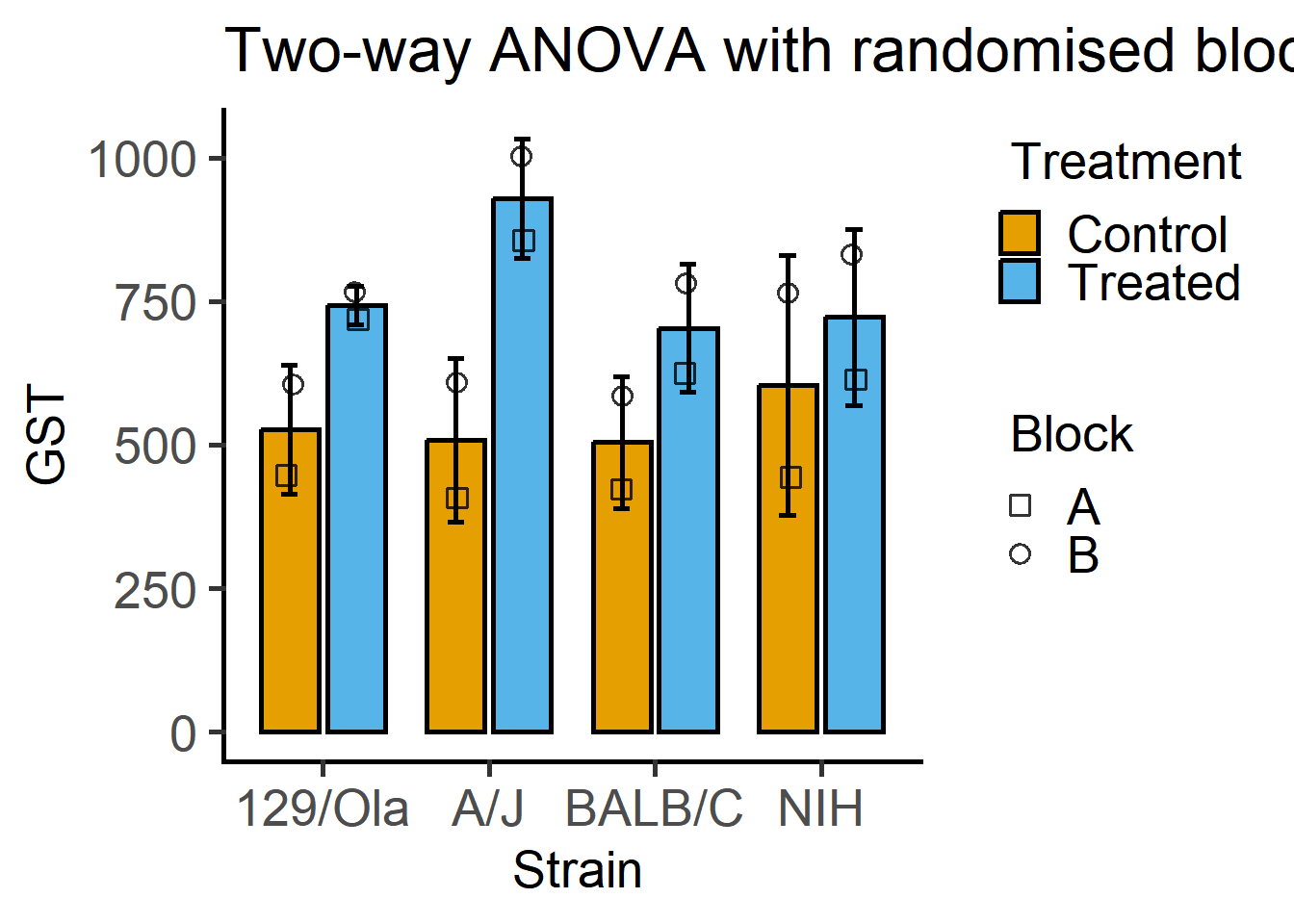
These are the data we used in Chapter 7 in Figure Figure 7.3.
plot_xy_CatGroup(PITime,         #data
                 Time2,          #xcol
                 PI,             #ycol
                 Genotype,       #grouping variable
                 Boxplot = TRUE, #show box plot
                 bwid = 50,      #set width based on X-axis scale
                 TextXAngle = 45,#angled X-axis text
                 fontsize = 18,  #font size
                 facet = Genotype)+ #faceting
  labs(title = "Numeric XY graph")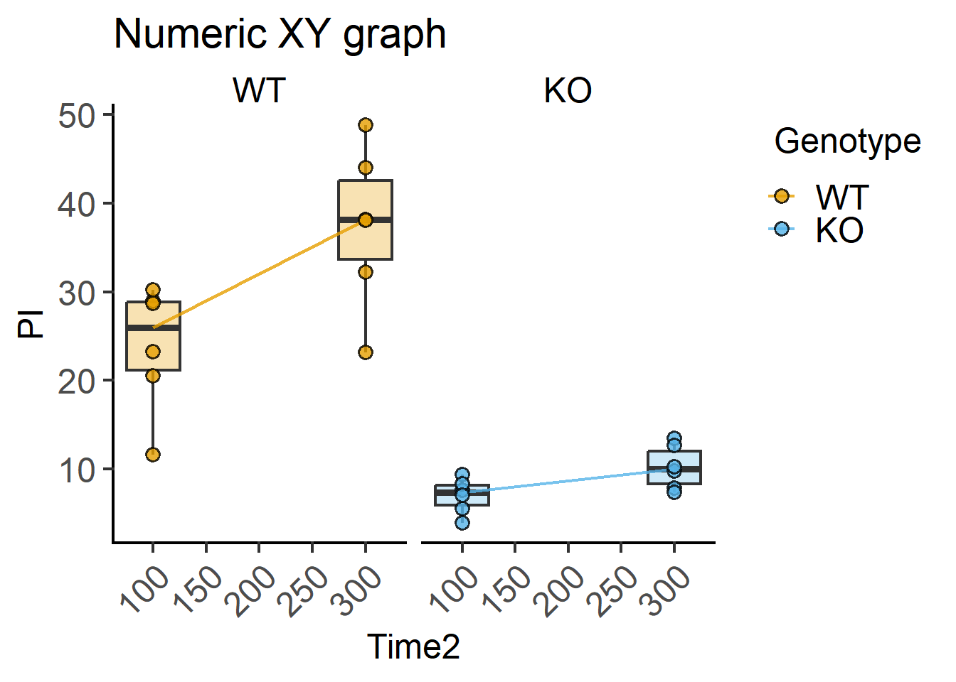
Here are the graphs you can plot with grafify. These can be further modified with additional layers/geometries with ggplot2.
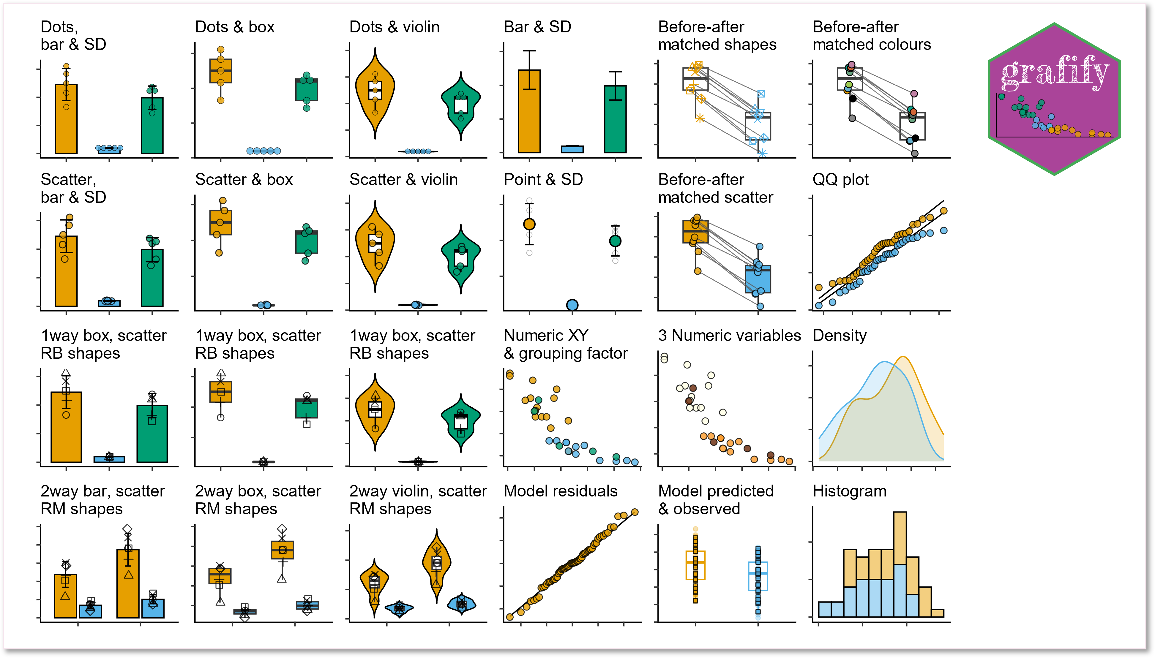
grafify also offers many colour blind-friends colour schemes.
Head over to grafify to see full features.
grafifygrafify also offers shorter arguments for fitting linear models with lm or linear mixed effects models with lmer. More recently, generalised additive models (gams) can also be fit using grafify.
One example is provided here for a two-way ANOVA from Chapter 6. Linear mixed effects analyses in grafify is possible with the function mixed_model, and an ordinary or simple model without random effects is fit with simple_model.
#fit a model
mxmodgraf1 <- mixed_model(data = Mice,                 #data table
                          Y_value = "GST",             #Y variable
                          Fixed_Factor = c("Strain",   #fixed factors
                                           "Treatment"),
                          Random_Factor = "Block")     #random factor
QQ plot of residual
#qq plot of residuals
plot_qqmodel(mxmodgraf1)     #model as above or with lmer etc.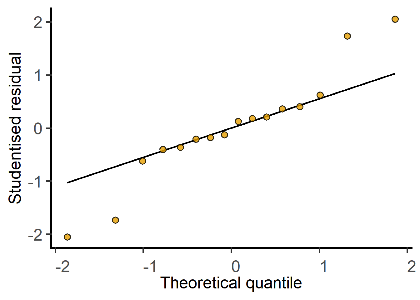
Get the ANOVA table.
#type II anova table
mixed_anova(data = Mice,                   #data table
            Y_value = "GST",               #Y variable
            Fixed_Factor = c("Strain",     #fixed factors
                             "Treatment"),
            Random_Factor = "Block")       #random factor
Type II Analysis of Variance Table with Kenward-Roger's method
Sum Sq Mean Sq NumDF DenDF F value Pr(>F)
Strain 28613 9538 3 7 3.2252 0.09144 .
Treatment 227529 227529 1 7 76.9394 5.041e-05 ***
Strain:Treatment 49591 16530 3 7 5.5897 0.02832 *
---
Signif. codes: 0 '***' 0.001 '**' 0.01 '*' 0.05 '.' 0.1 ' ' 1Perform post-doc comparisons with posthoc_ functions. Here we use the levelwise function to compare whether Treatment had an effect on each strain of mouse.
#posthoc comparison
posthoc_Levelwise(Model = mxmodgraf1,           #model from above
                  Fixed_Factor = c("Treatment", #fixed factors
                                   "Strain"))
$emmeans
Strain = 129/Ola:
Treatment emmean SE df lower.CL upper.CL
Control 526 95.2 1.36 -140.0 1193
Treated 742 95.2 1.36 76.0 1409
Strain = A/J:
Treatment emmean SE df lower.CL upper.CL
Control 508 95.2 1.36 -158.0 1175
Treated 929 95.2 1.36 262.5 1595
Strain = BALB/C:
Treatment emmean SE df lower.CL upper.CL
Control 504 95.2 1.36 -162.0 1171
Treated 704 95.2 1.36 37.0 1370
Strain = NIH:
Treatment emmean SE df lower.CL upper.CL
Control 604 95.2 1.36 -62.5 1270
Treated 722 95.2 1.36 56.0 1389
Degrees-of-freedom method: kenward-roger
Confidence level used: 0.95
$contrasts
Strain = 129/Ola:
contrast estimate SE df t.ratio p.value
Control - Treated -216 54.4 7 -3.972 0.0054
Strain = A/J:
contrast estimate SE df t.ratio p.value
Control - Treated -420 54.4 7 -7.733 0.0001
Strain = BALB/C:
contrast estimate SE df t.ratio p.value
Control - Treated -199 54.4 7 -3.659 0.0081
Strain = NIH:
contrast estimate SE df t.ratio p.value
Control - Treated -118 54.4 7 -2.179 0.0657
Degrees-of-freedom method: kenward-roger grafifyVisit the vignette website for more details on how to
ggplot2 object